Category : Straightforward The 57 UX Principles are grouped under 6 categories (Straightforward/Flowing/Engaging/Distinctive/Supportive/Reliable). Each category describes an aspect of the Zurich User Experience.
Segmentation : Best Practice The Zurich Guidelines are divided into two categories: Uniquely Zurich (principles that are inspired by current projects and initiatives within Zurich and aim to push the user experience further) and Best Practice (principles that cover basic, yet essential guidelines to deliver a good UX experience).
UX Principle number : ST03 The UX Principle number is unique to each principle. It can be used for referencing, listing, etc..
Applicable if you are designing:
Screen A single view or page within a digital product or application.
Product A tangible or digital offering that is designed and developed to fulfill specific user needs or solve problems.
Journey A path or series of steps that a user takes when interacting with a product or service to reach a goal/complete a task.
Ecosystem It refers to the broader context and interconnections surrounding a product or service. It involves the various touchpoints, channels, and interactions that users have with the product, as well as the supporting infrastructure, technologies, and external factors that influence the overall user experience.
Example
What good looks like
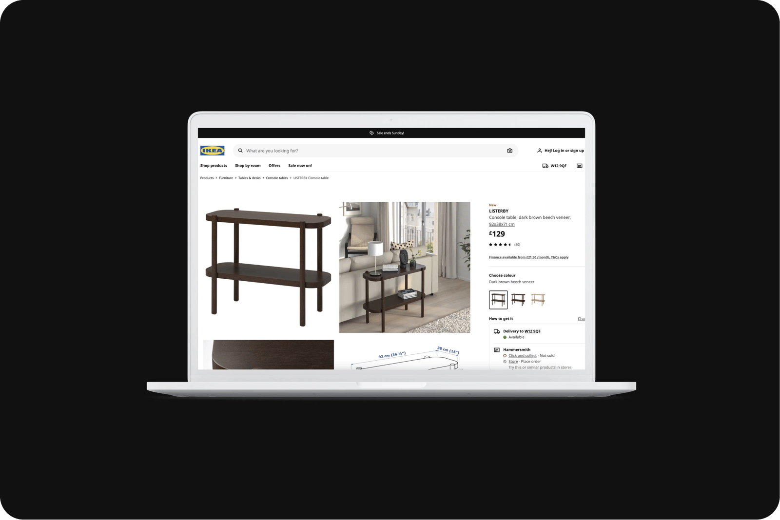
IKEA displays the path that leads to the page you are on enabling you to retrace your steps and go back to other pages. This path is often referred to as a breadcrumb referencing the Hansel & Gretel fairy tale where they left a breadcrumb trail to get home without becoming lost.
Apple iOS set-up assistant allows users to go back and change their previous choices in the event users have made the wrong decision.

Nielson Norman Group has clear domain titles and URL structures showing where you are at a glance, which also helps customers maneuverer around the site more efficiently.

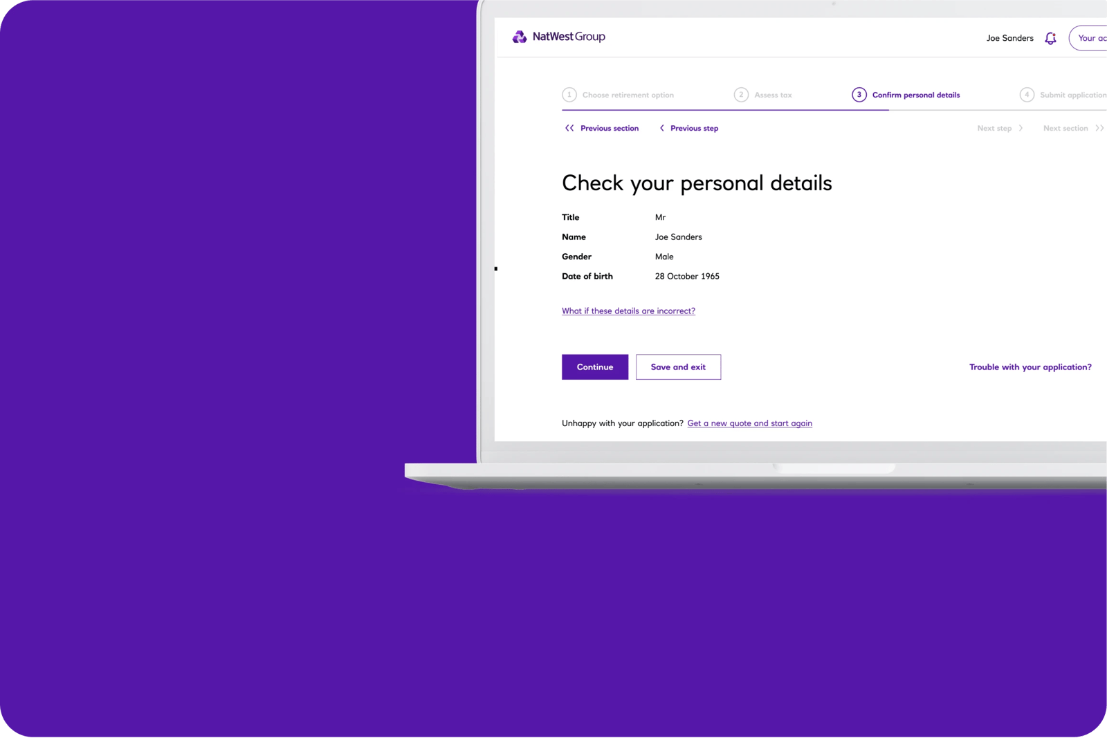
NatWest Pension application enables you to click on the wizard to go back to specific sections or skip pages/sections backwards and forwards.
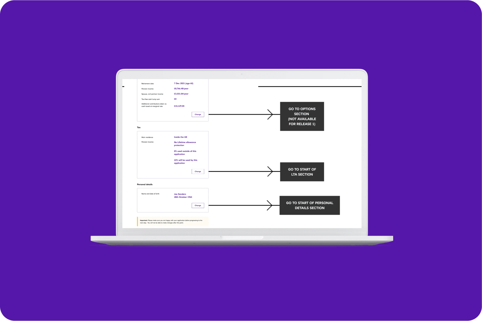
Zurich gives a summary of customers' answers at the end of the application process and allows them to jump back into specific sections.
Unilever has quite a deep site, so it uses breadcrumbs. It also has very clear titles that reference the journey the user has been on. E.g., they are on the Strategy and Goals page within the Raise Living Standards section.
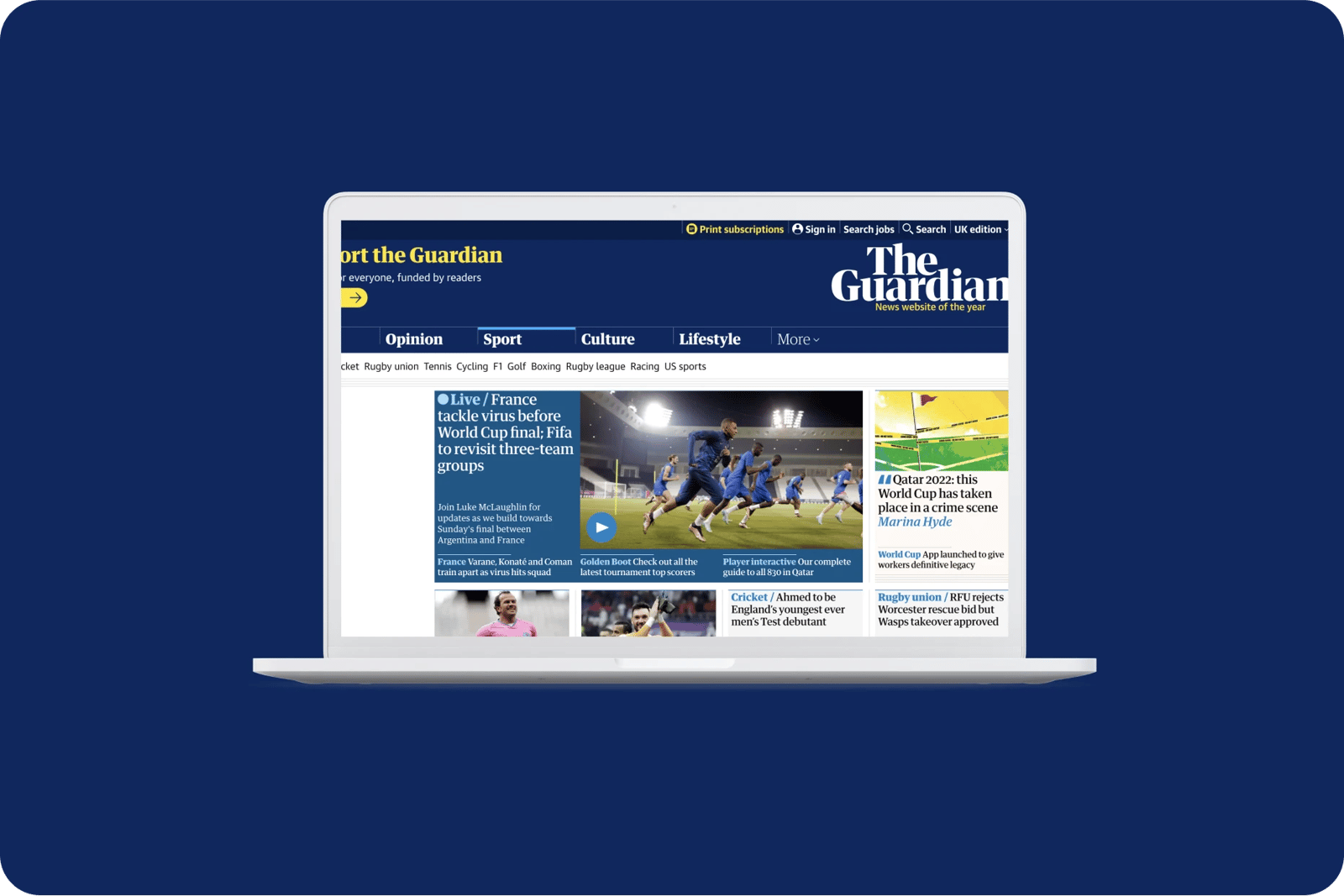
The Guardian shows which section of the website you are in by highlighting that area of the navigation. It repeats the section colour across elements of the UI such as the titles of articles and journalist photographs to reinforce the different sections of the site.
What bad looks like
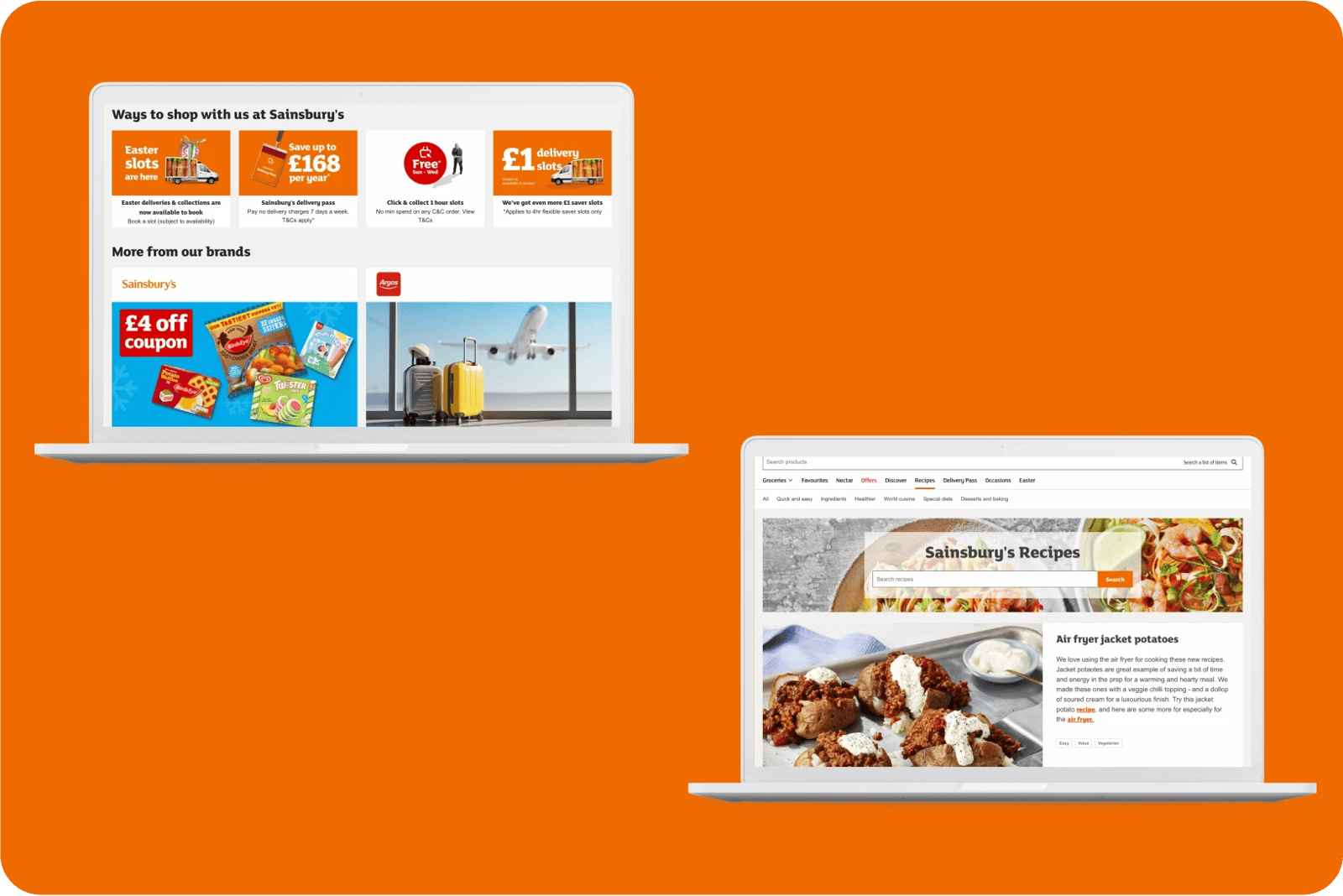
It is hard to differentiate the general Sainsbury’s website from the grocery section. The content duplication makes it hard to understand which platform the user is on. On pages like ‘Food to Order', the original navigation at the top of the page disappeared and there is no link to go back to sainsburys.co.uk.

Related CX Standards


All the categories
Straightforward
Fulfill fundamental user needs information is displayed in a clear and structured way, only showing what is necessary.

Flowing
Anticipate user behaviours and help users move through journeys.
.webp?iar=0&w=1600)
Distinctive
Offer a distinctive Zurich experience and promotes sustainable behaviours.

Supportive
Follow brand guidelines, presents up-to-date information and be transparent with customers.

Engaging
Present relevant content in a visually appealing and intriguing way.

Reliable
Follow brand guidelines, presents up-to-date information and be transparent with customers.
Contact us if:
-
You would like to add good and bad examples related to this principle.
-
You have some suggestions regarding the UX principle itself.
-
You would like to add some UX principles.
Email to cx@zurich.com.