Category : Straightforward The 57 UX Principles are grouped under 6 categories (Straightforward/Flowing/Engaging/Distinctive/Supportive/Reliable). Each category describes an aspect of the Zurich User Experience.
Segmentation : Best Practice The Zurich Guidelines are divided into two categories: Uniquely Zurich (principles that are inspired by current projects and initiatives within Zurich and aim to push the user experience further) and Best Practice (principles that cover basic, yet essential guidelines to deliver a good UX experience).
UX Principle number : ST04 The UX Principle number is unique to each principle. It can be used for referencing, listing, etc..
Applicable if you are designing:
Screen A single view or page within a digital product or application.
Product A tangible or digital offering that is designed and developed to fulfill specific user needs or solve problems.
Journey A path or series of steps that a user takes when interacting with a product or service to reach a goal/complete a task.
Ecosystem It refers to the broader context and interconnections surrounding a product or service. It involves the various touchpoints, channels, and interactions that users have with the product, as well as the supporting infrastructure, technologies, and external factors that influence the overall user experience.
Example
What good looks like
On the Shazam app, the placement of the button and the fluid animation guides users and shows the system action with a hint of sophistication.

Google search page is clean and minimal which focuses the user's attention on the search engine which is the primary function.

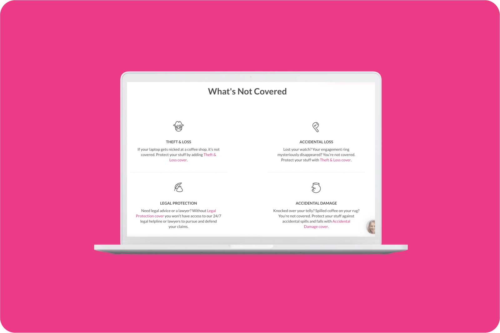
Lemonade insurance explains what is covered and what is not using simple language, icons and a minimal layout which helps maintain a focus of key pieces on information for customers.

Zurich UK uses tooltips to explain insurance terms in a 'human way' using simple language during the quote process.

What bad looks like
BuzzStream’s interface is crowded, and there is no hierarchy. It is hard to differentiate the features and find the one you need.

Related CX Standards
All the categories
Contact us if:
-
You would like to add good and bad examples related to this principle.
-
You have some suggestions regarding the UX principle itself.
-
You would like to add some UX principles.
Email to cx@zurich.com.


.webp?iar=0&w=1600)


