Category : Supportive The 57 UX Principles are grouped under 6 categories (Straightforward/Flowing/Engaging/Distinctive/Supportive/Reliable). Each category describes an aspect of the Zurich User Experience.
Segmentation : Best Practice The Zurich Guidelines are divided into two categories: Uniquely Zurich (principles that are inspired by current projects and initiatives within Zurich and aim to push the user experience further) and Best Practice (principles that cover basic, yet essential guidelines to deliver a good UX experience).
UX Principle number : SU10 The UX Principle number is unique to each principle. It can be used for referencing, listing, etc..
Applicable if you are designing:
Screen A single view or page within a digital product or application.
Product A tangible or digital offering that is designed and developed to fulfill specific user needs or solve problems.
Journey A path or series of steps that a user takes when interacting with a product or service to reach a goal/complete a task.
Ecosystem It refers to the broader context and interconnections surrounding a product or service. It involves the various touchpoints, channels, and interactions that users have with the product, as well as the supporting infrastructure, technologies, and external factors that influence the overall user experience.
Example
What good looks like
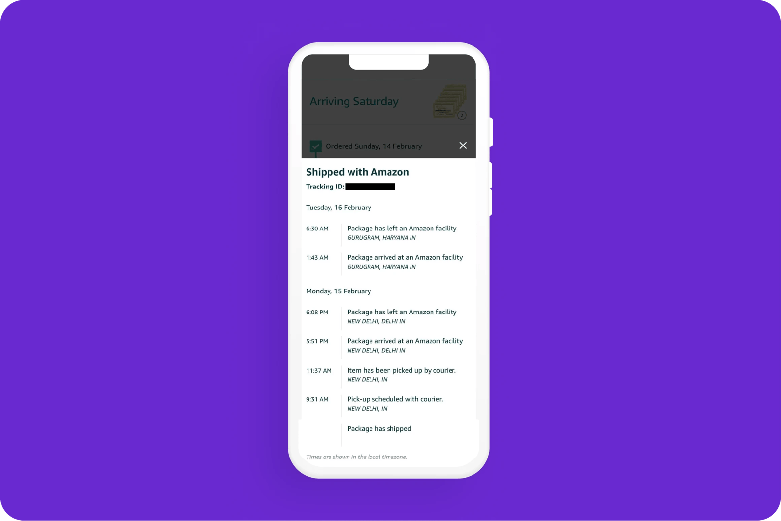
Amazon gives a clear breakdown of where the customer's parcel has been, is now, and when it will arrive via live updates that can be accessed across devices.
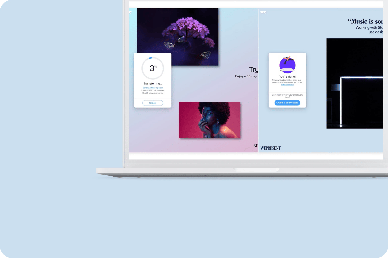
WeTransfer tells users the progress of their file transfer as a visual; percentage; file/data size; and a time remaining estimate. The visuals help guide customers with simple comprehension.
Google Snackbars and toasts keep the user updated on what the system is doing to avoid any confusion along with the bonus of option of ‘retrying’ through a CTA.
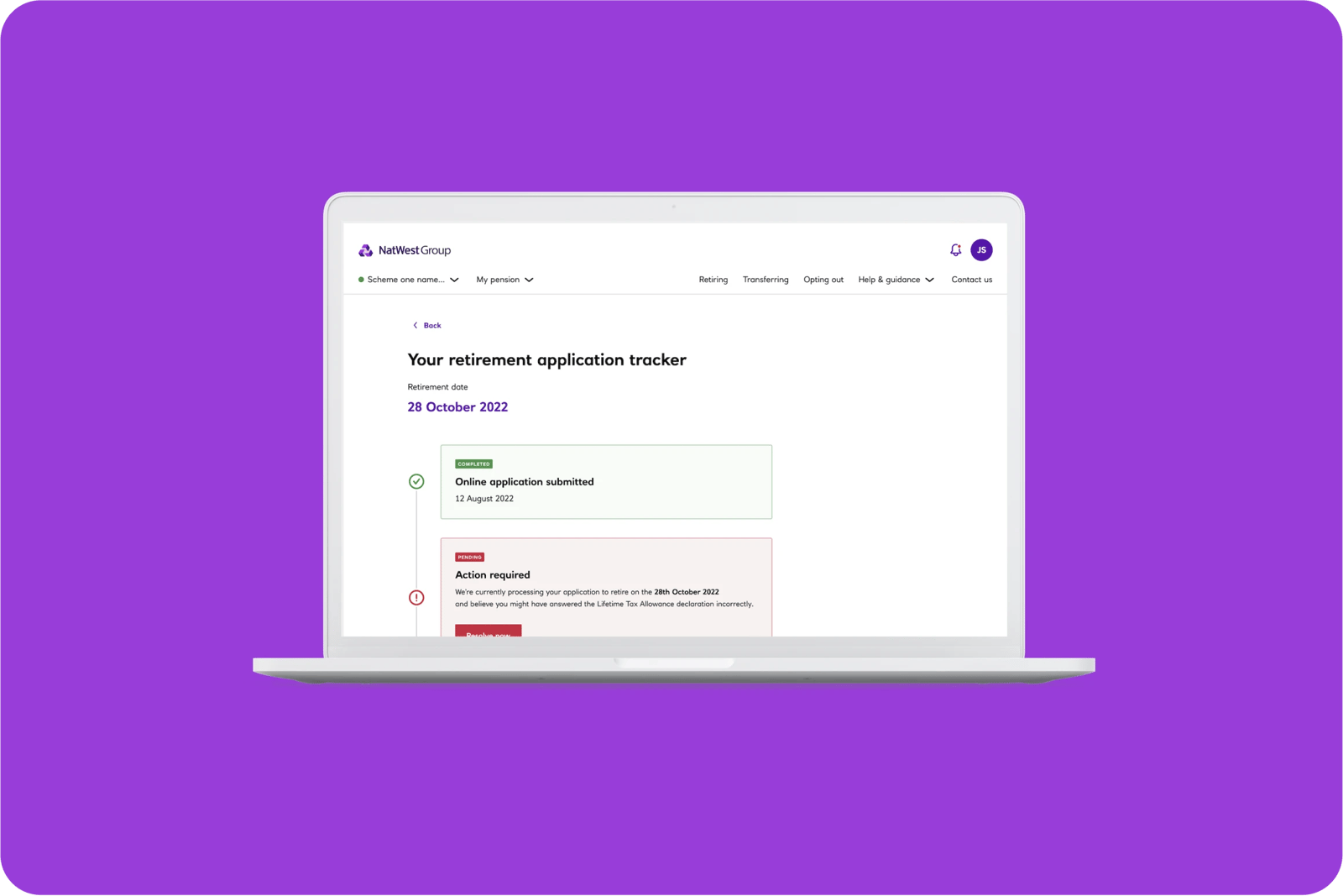
NatWest's pension application tracker keeps people informed and tells them if/when they need to do something which makes the experience feel more live and tailored for customers.

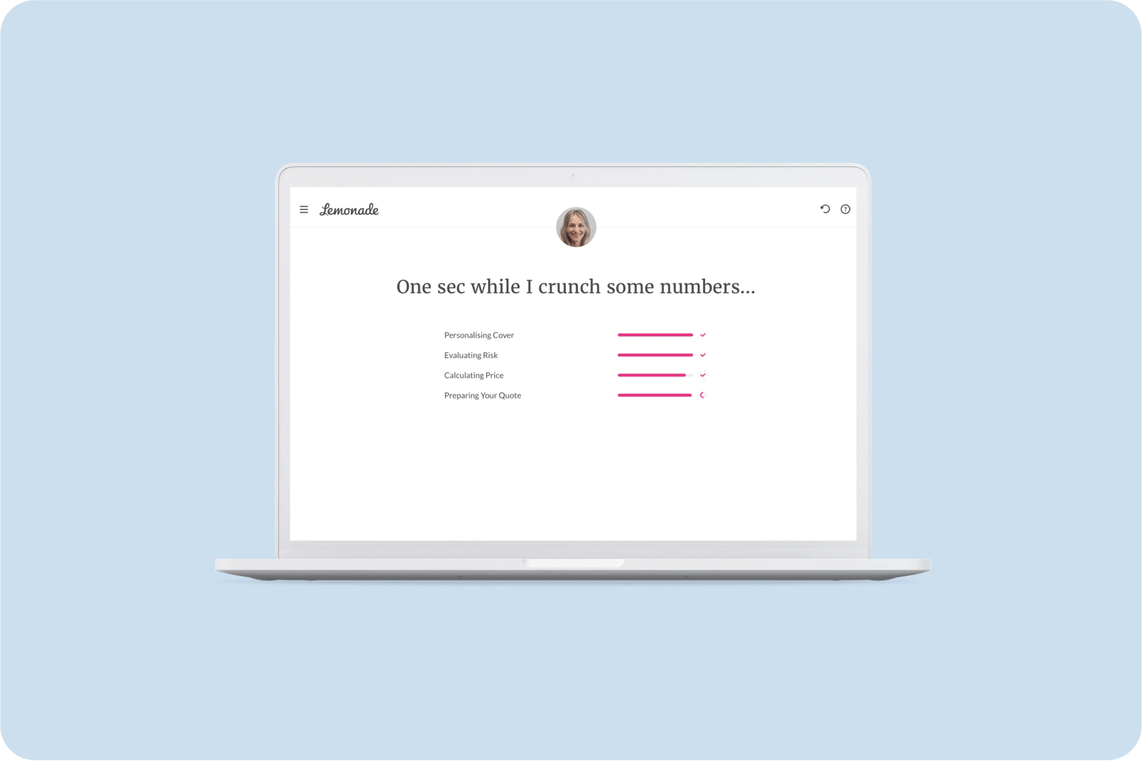
While they are loading your quote, Lemonade Insurance let you know what the system is analysing and computing through illustrations and animations.
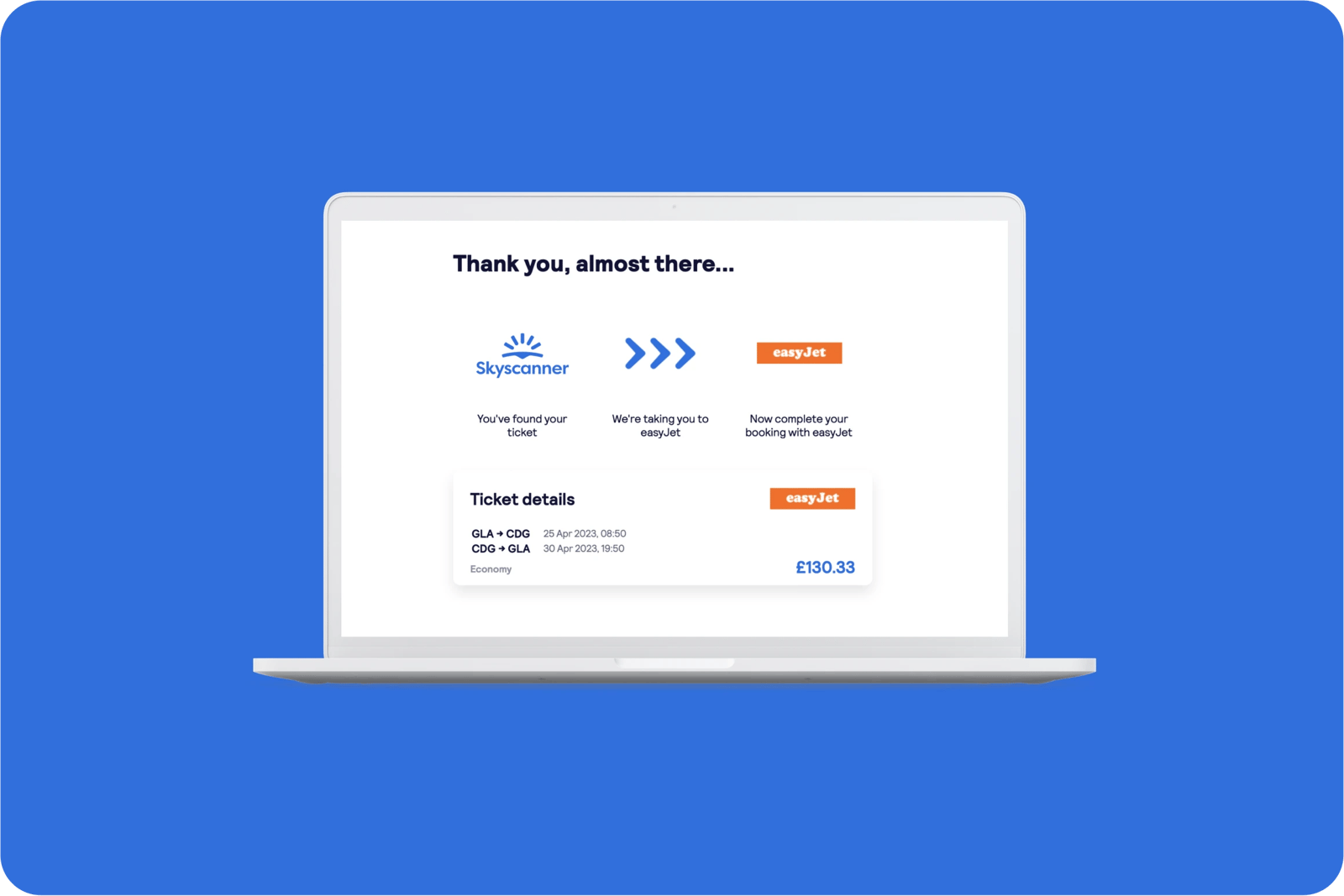
Skyscanner tells users what the system is doing with clean, useful illustrations that help guide them.
What bad looks like
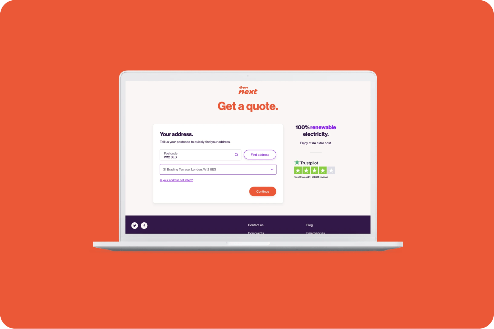
E-ON Energy take you through a quote process with no stages of progress so customers have no indication of how long the quote will take to access.
Related CX Standards
All the categories
Contact us if:
-
You would like to add good and bad examples related to this principle.
-
You have some suggestions regarding the UX principle itself.
-
You would like to add some UX principles.
Email to cx@zurich.com.



.webp?iar=0&w=1600)

