Category : Supportive The 57 UX Principles are grouped under 6 categories (Straightforward/Flowing/Engaging/Distinctive/Supportive/Reliable). Each category describes an aspect of the Zurich User Experience.
Segmentation : Best Practice The Zurich Guidelines are divided into two categories: Uniquely Zurich (principles that are inspired by current projects and initiatives within Zurich and aim to push the user experience further) and Best Practice (principles that cover basic, yet essential guidelines to deliver a good UX experience).
UX Principle number : SU05 The UX Principle number is unique to each principle. It can be used for referencing, listing, etc..
Applicable if you are designing:
Screen A single view or page within a digital product or application.
Product A tangible or digital offering that is designed and developed to fulfill specific user needs or solve problems.
Journey A path or series of steps that a user takes when interacting with a product or service to reach a goal/complete a task.
Ecosystem It refers to the broader context and interconnections surrounding a product or service. It involves the various touchpoints, channels, and interactions that users have with the product, as well as the supporting infrastructure, technologies, and external factors that influence the overall user experience.
Example
What good looks like
The Guardian details upfront why and how they use cookies.

To verify an account, Facebook asks for the user's ID explaining why it needs it and how long it will be stored.

NatWest pension site provides a 'why do we need this?' tooltip alongside data entry points in forms.

Domino's tells the customer the benefits they'll receive in exchange for providing their postcode. This gesture of good will massively helps increase customer retention.

Google tells the user the information that is being collected, then allows them to deep dive into the why and how. The user is also able to toggle settings if unhappy with them.

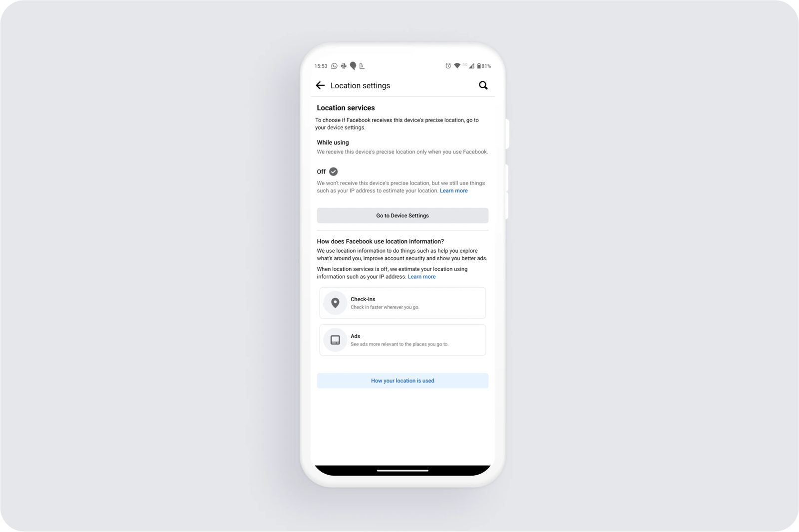
When asking users to switch on their location settings, Facebook tells them how it is used.

What bad looks like
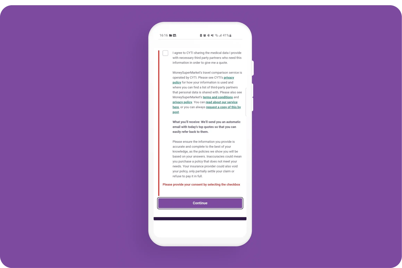
When sharing their information with MoneySuperMarket, the customer is made aware that their data will be shared with third party sites but is not given reassurances of what and how it will be shared. The onus is on the customer to hunt through T&Cs to find out.

Related CX Standards
All the categories
Contact us if:
-
You would like to add good and bad examples related to this principle.
-
You have some suggestions regarding the UX principle itself.
-
You would like to add some UX principles.
Email to cx@zurich.com.


.webp?iar=0&w=1600)


