Category : Supportive The 57 UX Principles are grouped under 6 categories (Straightforward/Flowing/Engaging/Distinctive/Supportive/Reliable). Each category describes an aspect of the Zurich User Experience.
Segmentation : Uniquely Zurich The Zurich Guidelines are divided into two categories: Uniquely Zurich (principles that are inspired by current projects and initiatives within Zurich and aim to push the user experience further) and Best Practice (principles that cover basic, yet essential guidelines to deliver a good UX experience).
UX Principle number : SU03 The UX Principle number is unique to each principle. It can be used for referencing, listing, etc..
Applicable if you are designing:
Screen A single view or page within a digital product or application.
Product A tangible or digital offering that is designed and developed to fulfill specific user needs or solve problems.
Journey A path or series of steps that a user takes when interacting with a product or service to reach a goal/complete a task.
Ecosystem It refers to the broader context and interconnections surrounding a product or service. It involves the various touchpoints, channels, and interactions that users have with the product, as well as the supporting infrastructure, technologies, and external factors that influence the overall user experience.
Example
What good looks like
The Guardian uses customer data to encourage users to make some donations, making the experience more tailored.

Starling bank cites industry awards and reviews, Trustpilot ratings and FSCS protected insurance certification to build credibility and trust.

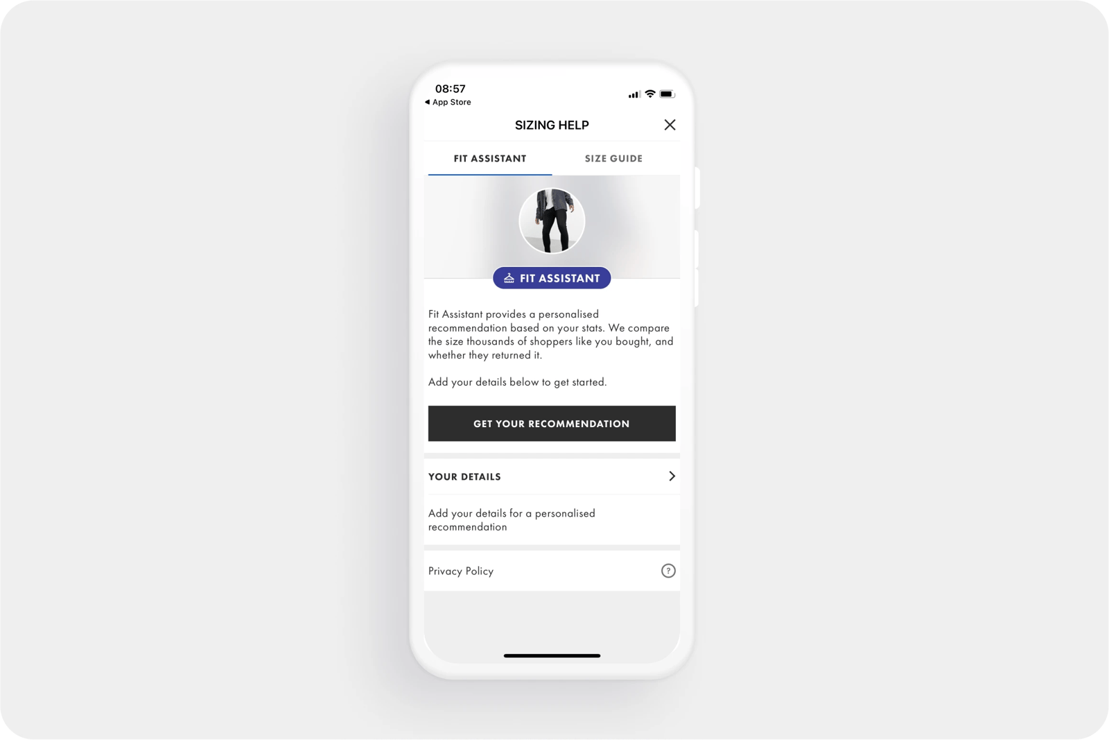
Asos uses AI to analyse their returns data and tell shoppers the size they are most likely to be happy with, based on the user's own purchase behaviour and measurements.

TripAdvisor uses customer data and reviews to give users more insight into hotels within a specific geographic area. Providing ordered rankings based on a set of filters, and 'most popular right now' lists.

Google Scholar shows how many people have cited particular articles.

What bad looks like
Costco throws together a series of randomised marketing banners with products that don't particularly feel relevant to any user group.

Related CX Standards
All the categories
Contact us if:
-
You would like to add good and bad examples related to this principle.
-
You have some suggestions regarding the UX principle itself.
-
You would like to add some UX principles.
Email to cx@zurich.com.


.webp?iar=0&w=1600)


