Category : Supportive The 57 UX Principles are grouped under 6 categories (Straightforward/Flowing/Engaging/Distinctive/Supportive/Reliable). Each category describes an aspect of the Zurich User Experience.
Segmentation : Uniquely Zurich The Zurich Guidelines are divided into two categories: Uniquely Zurich (principles that are inspired by current projects and initiatives within Zurich and aim to push the user experience further) and Best Practice (principles that cover basic, yet essential guidelines to deliver a good UX experience).
UX Principle number : SU01 The UX Principle number is unique to each principle. It can be used for referencing, listing, etc..
Applicable if you are designing:
Screen A single view or page within a digital product or application.
Product A tangible or digital offering that is designed and developed to fulfill specific user needs or solve problems.
Journey A path or series of steps that a user takes when interacting with a product or service to reach a goal/complete a task.
Ecosystem It refers to the broader context and interconnections surrounding a product or service. It involves the various touchpoints, channels, and interactions that users have with the product, as well as the supporting infrastructure, technologies, and external factors that influence the overall user experience.
Example
What good looks like
Metro Bank Contact US pages provide a variety of ways to speak with someone (live chat, phone numbers etc) - guiding people towards the best number/channel for their enquiry and explaining their opening hours and expected call charge.

Zurich (Switzerland) displays CTA to call at the bottom of each page.

On GOV.UK, the process to apply for self-employed status is straightforward and transparent. It clearly indicates the steps to users as they progress through their selection. Reliability, clarity and support are the top priorities for GOV.UK.

HSBC has an always-on chat feature that users can access anywhere on the site to discuss their issues.

What bad looks like
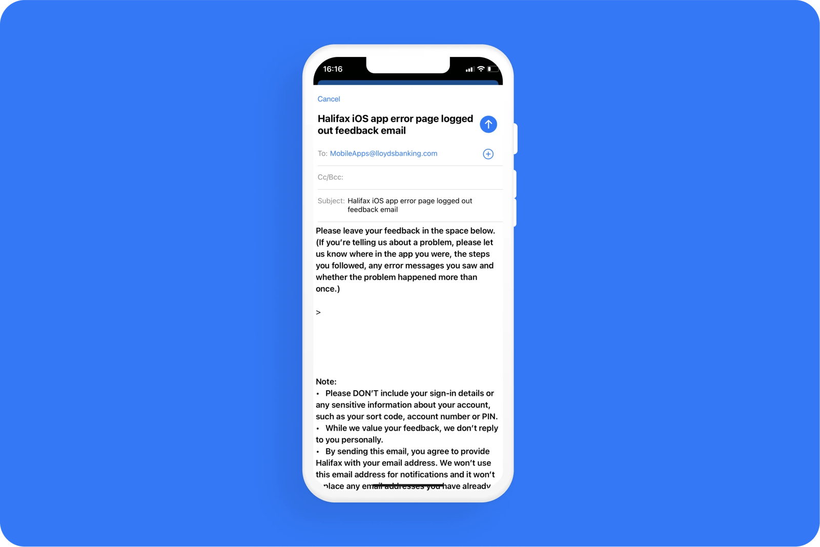
When reporting an error with Halifax, users are informed that they won't get a personal answer.

Related CX Standards
All the categories
Contact us if:
-
You would like to add good and bad examples related to this principle.
-
You have some suggestions regarding the UX principle itself.
-
You would like to add some UX principles.
Email to cx@zurich.com.


.webp?iar=0&w=1600)


