Category : Distinctive The 57 UX Principles are grouped under 6 categories (Straightforward/Flowing/Engaging/Distinctive/Supportive/Reliable). Each category describes an aspect of the Zurich User Experience.
Segmentation : Best Practice The Zurich Guidelines are divided into two categories: Uniquely Zurich (principles that are inspired by current projects and initiatives within Zurich and aim to push the user experience further) and Best Practice (principles that cover basic, yet essential guidelines to deliver a good UX experience).
UX Principle number : DI08 The UX Principle number is unique to each principle. It can be used for referencing, listing, etc..
Applicable if you are designing:
Screen A single view or page within a digital product or application.
Product A tangible or digital offering that is designed and developed to fulfill specific user needs or solve problems.
Journey A path or series of steps that a user takes when interacting with a product or service to reach a goal/complete a task.
Ecosystem It refers to the broader context and interconnections surrounding a product or service. It involves the various touchpoints, channels, and interactions that users have with the product, as well as the supporting infrastructure, technologies, and external factors that influence the overall user experience.
Example
What good looks like
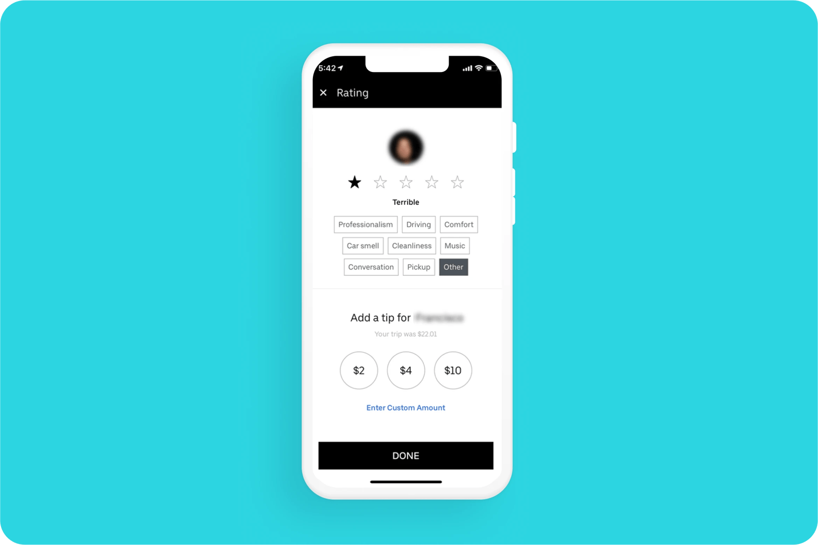
Ubers asks to review the customer's driver once they reach their destination using a star system. It is fast and easy.

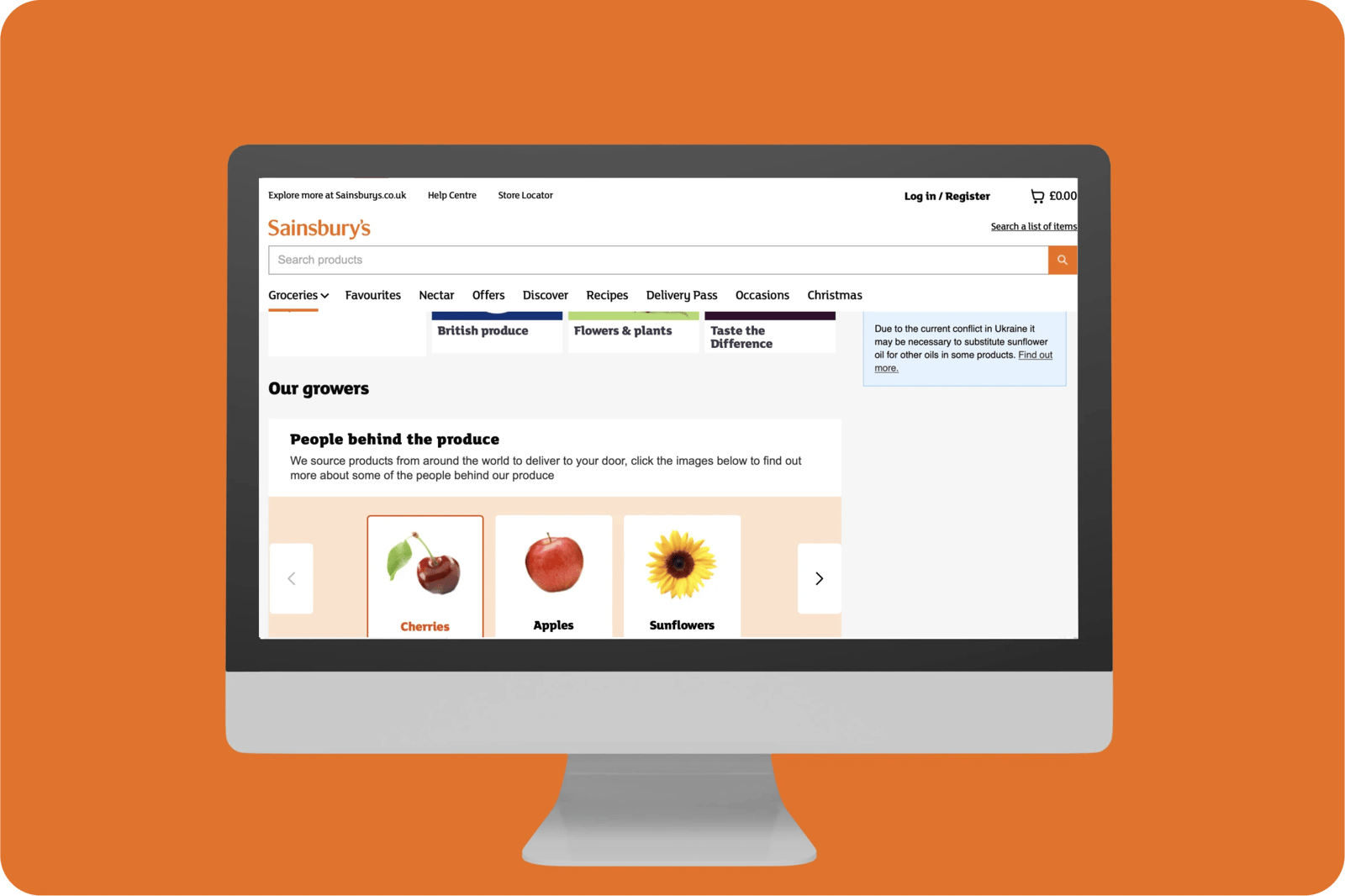
Sainsbury's customers can leave feedback whenever they want using the internal link located at the bottom of every page. They also add some quirky copy ('Lettuce know') to make the process a bit more light-hearted.

Slack enables users to give feedback when they want using on-demand feedback. This is a rather intuitive feature which makes the customer experience more fluid.

Stripe uses facial expressions and micro-interactions to make providing feedback fun for customers. This also helps maintain customers with a level of intrigue.

Miro places CTAs next to elements like tables, enabling users to give feedback while they are using the components which also helps the brand improve the overall experience.

What bad looks like
Trainline asks customers for feedback on their journey experience before the journey happens.

Related CX Standards
All the categories
Contact us if:
-
You would like to add good and bad examples related to this principle.
-
You have some suggestions regarding the UX principle itself.
-
You would like to add some UX principles.
Email to cx@zurich.com.


.webp?iar=0&w=1600)


