Category : Straightforward The 57 UX Principles are grouped under 6 categories (Straightforward/Flowing/Engaging/Distinctive/Supportive/Reliable). Each category describes an aspect of the Zurich User Experience.
Segmentation : Best Practice The Zurich Guidelines are divided into two categories: Uniquely Zurich (principles that are inspired by current projects and initiatives within Zurich and aim to push the user experience further) and Best Practice (principles that cover basic, yet essential guidelines to deliver a good UX experience).
UX Principle number : ST01 The UX Principle number is unique to each principle. It can be used for referencing, listing, etc..
Applicable if you are designing:
Screen A single view or page within a digital product or application.
Product A tangible or digital offering that is designed and developed to fulfill specific user needs or solve problems.
Journey A path or series of steps that a user takes when interacting with a product or service to reach a goal/complete a task.
Ecosystem It refers to the broader context and interconnections surrounding a product or service. It involves the various touchpoints, channels, and interactions that users have with the product, as well as the supporting infrastructure, technologies, and external factors that influence the overall user experience.
Example
What good looks like
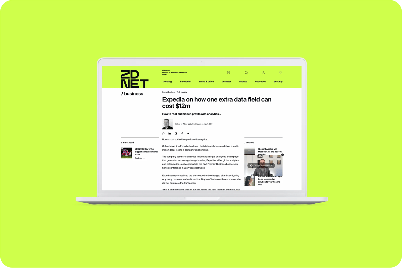
Expedia removed one optional data field from their checkout process to create more efficiency and increased revenue by $12m.
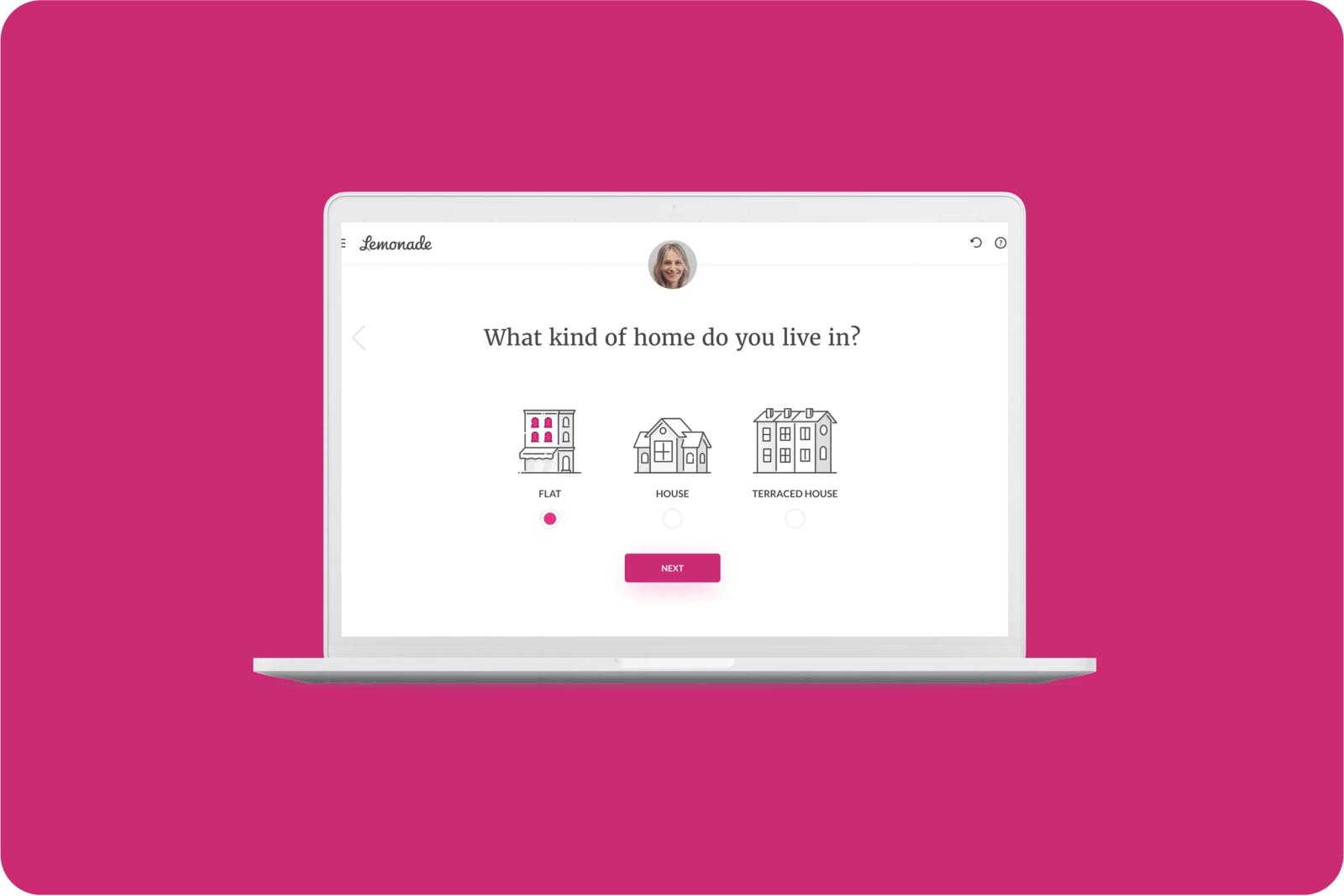
Lemonade insurance only presents one piece of information at a time during their quote process. The questionnaire is broken down into a series of pages, and content is reduced to the strict minimum to avoid distraction and confusion.
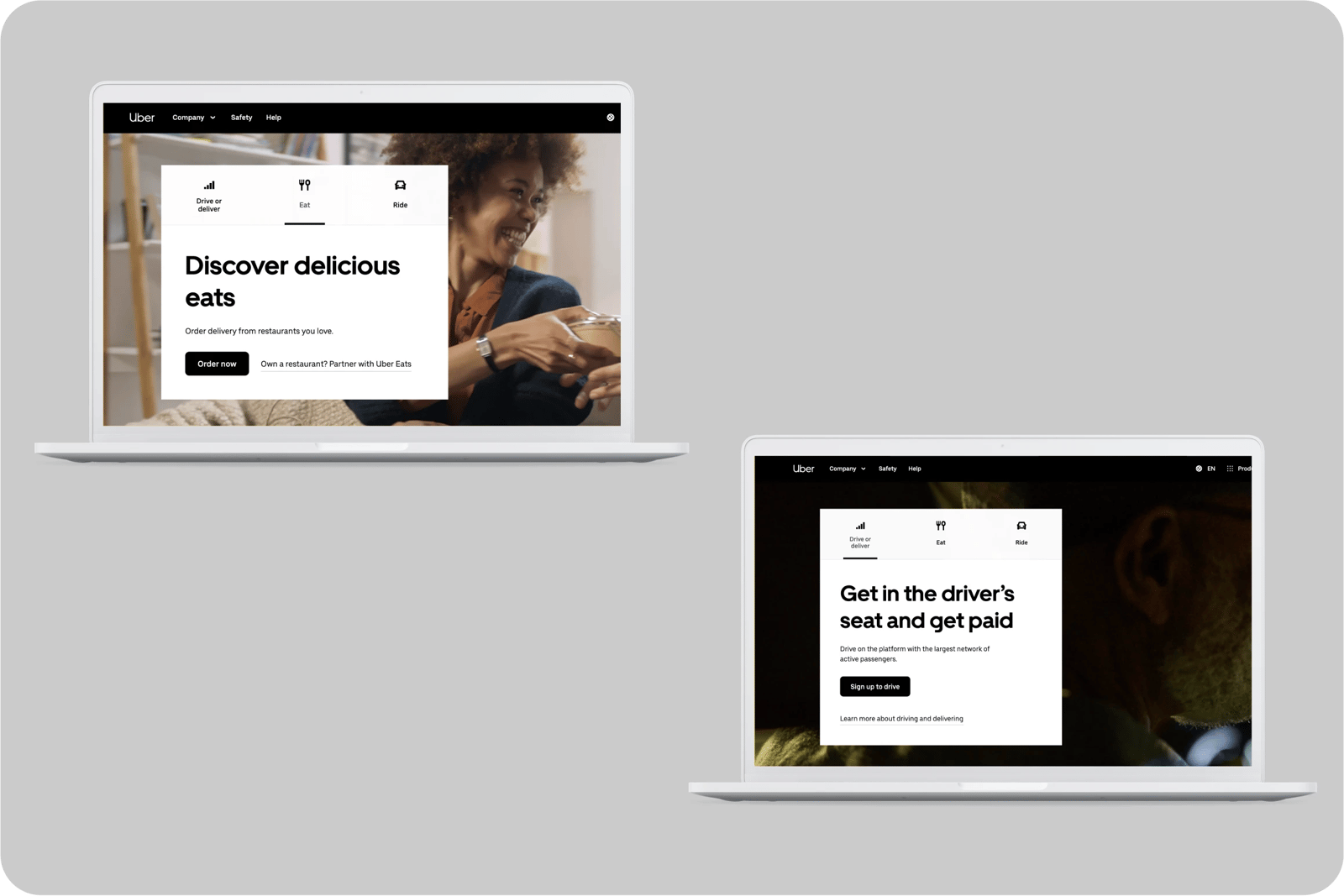
Uber manages to present very different value propositions next to each other, through clean and simple design, concise copy and stripping away all other distractions.
What bad looks like
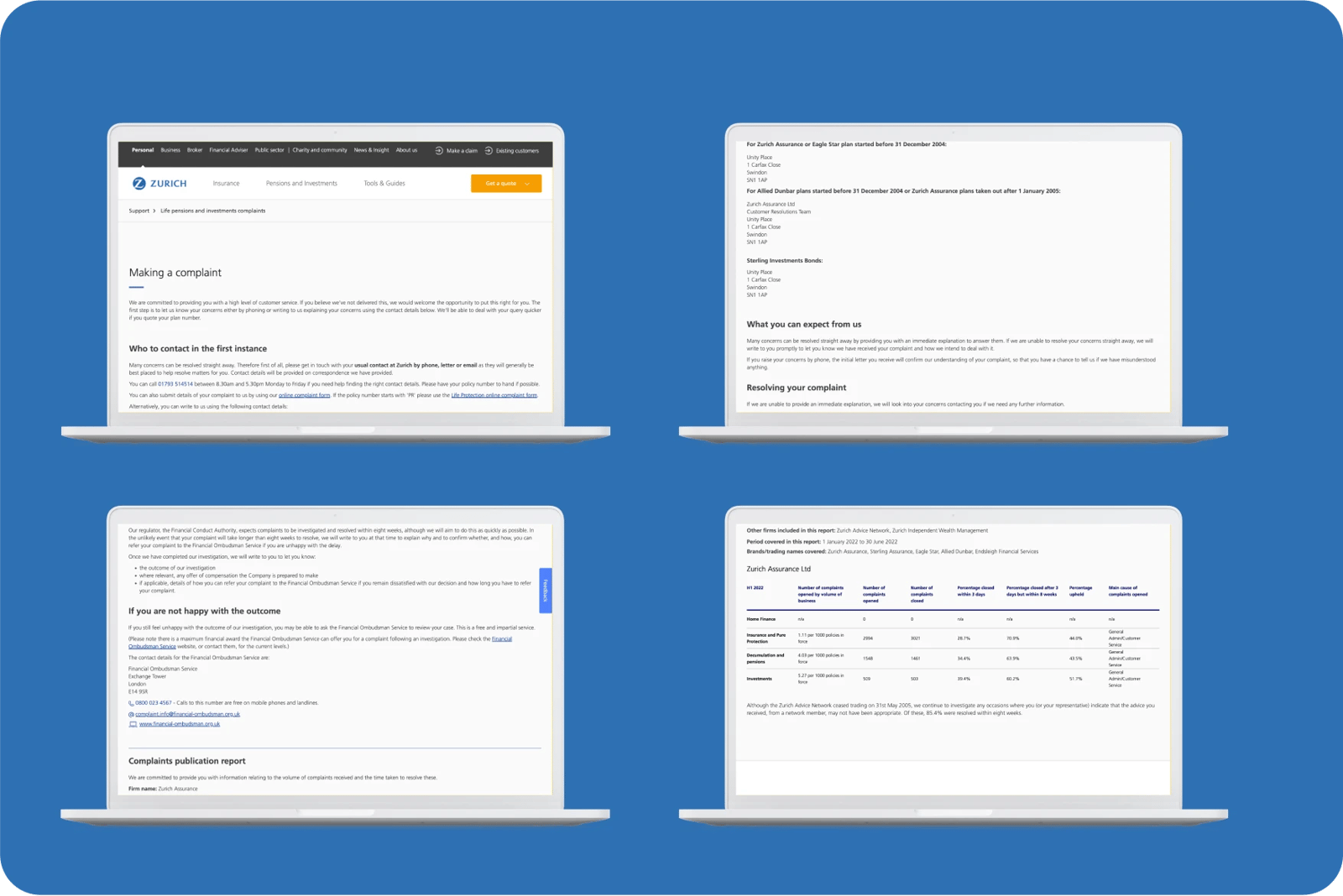
Zurich UK's complaint page is very long and copy-heavy. Information is not prioritised, and customers might feel overwhelmed by the amount of information displayed on this first page.

Related CX Standards


All the categories
Straightforward
Fulfill fundamental user needs information is displayed in a clear and structured way, only showing what is necessary.
Flowing
Anticipate user behaviours and help users move through journeys.
.webp?iar=0&w=1600)
Distinctive
Offer a distinctive Zurich experience and promotes sustainable behaviours.

Supportive
Follow brand guidelines, presents up-to-date information and be transparent with customers.

Engaging
Present relevant content in a visually appealing and intriguing way.

Reliable
Follow brand guidelines, presents up-to-date information and be transparent with customers.
Contact us if:
-
You would like to add good and bad examples related to this principle.
-
You have some suggestions regarding the UX principle itself.
-
You would like to add some UX principles.
Email to cx@zurich.com.