Category : Distinctive The 57 UX Principles are grouped under 6 categories (Straightforward/Flowing/Engaging/Distinctive/Supportive/Reliable). Each category describes an aspect of the Zurich User Experience.
Segmentation : Uniquely Zurich The Zurich Guidelines are divided into two categories: Uniquely Zurich (principles that are inspired by current projects and initiatives within Zurich and aim to push the user experience further) and Best Practice (principles that cover basic, yet essential guidelines to deliver a good UX experience).
UX Principle number : DI02 The UX Principle number is unique to each principle. It can be used for referencing, listing, etc..
Applicable if you are designing:
Screen A single view or page within a digital product or application.
Product A tangible or digital offering that is designed and developed to fulfill specific user needs or solve problems.
Journey A path or series of steps that a user takes when interacting with a product or service to reach a goal/complete a task.
Ecosystem It refers to the broader context and interconnections surrounding a product or service. It involves the various touchpoints, channels, and interactions that users have with the product, as well as the supporting infrastructure, technologies, and external factors that influence the overall user experience.
Example
What good looks like
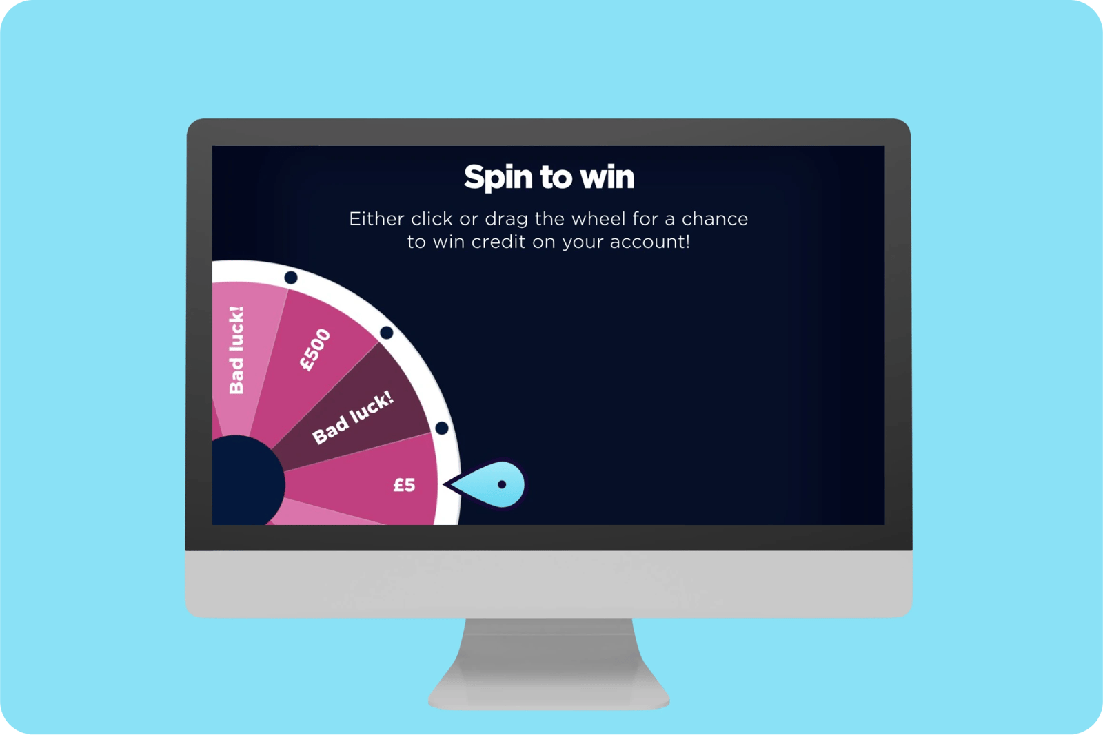
Octopus Energy gives people a wheel of fortune style game interaction every time they submit a meter reading. This helps to make a more engaging experience for users.
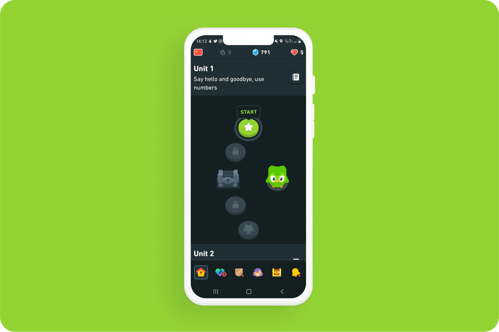
Duolingo uses video game principles and aesthetics to make language learning fun and interactive for users. This progressively enables users to be more engaged.
LinkedIn uses gamification tactics to encourage users to add more data to their profiles which in turn makes the experience more intriguing for users.

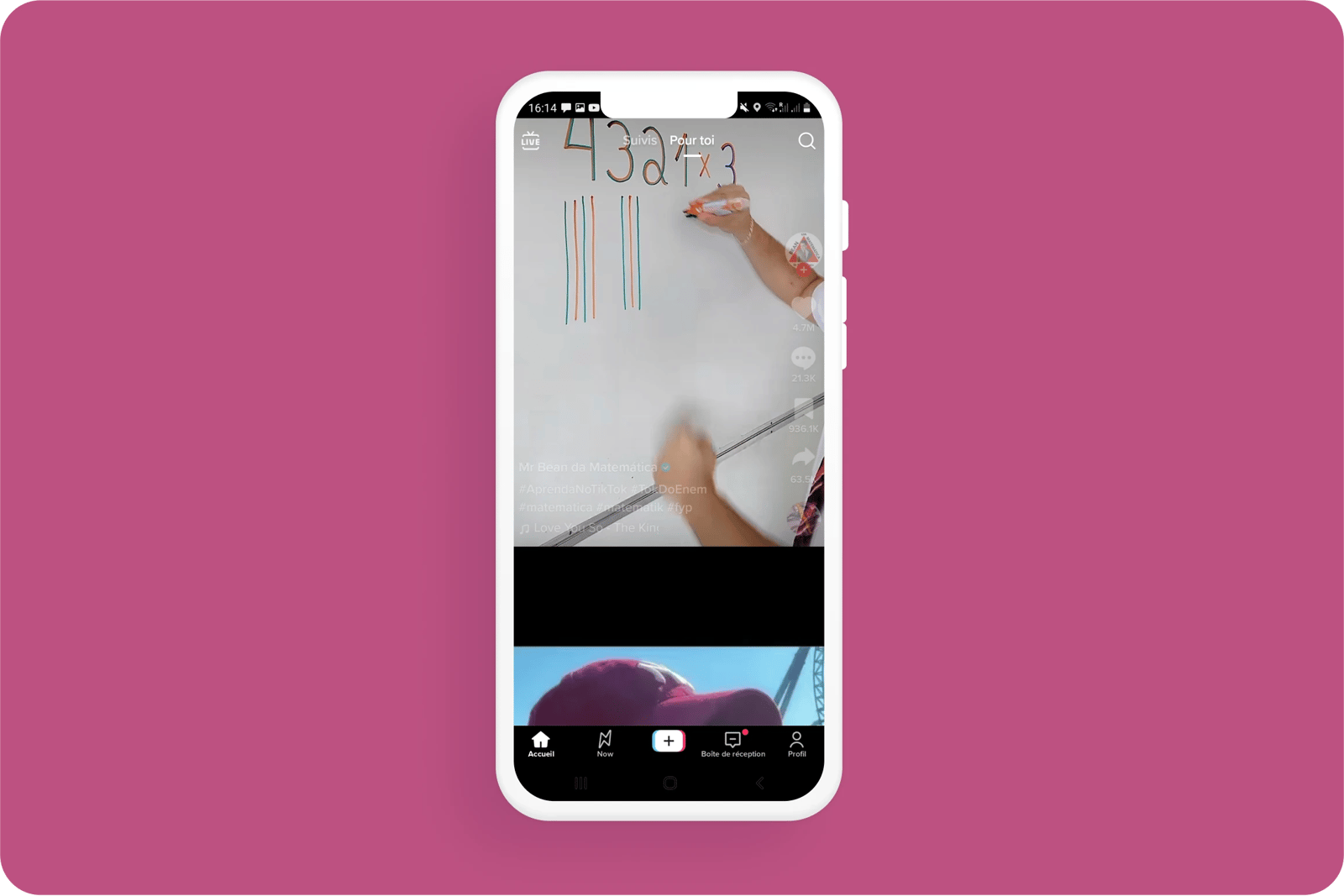
TikTok immediately starts videos as soon as people open the app, so they become instantly immersed and engaged with the content. Videos take up most of the screen, with content like hashtags and comments provided as an overlay instead of being placed underneath like it is on Instagram.
What bad looks like
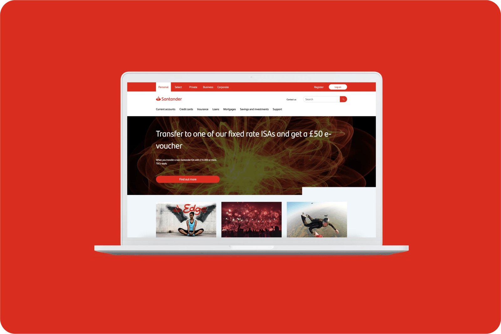
Santander uses less than desirable stock imagery to promote a new offering, leaving the customer with a dull experience.

All the categories
Straightforward
Fulfill fundamental user needs information is displayed in a clear and structured way, only showing what is necessary.
Flowing
Anticipate user behaviours and help users move through journeys.
.webp?iar=0&w=1600)
Distinctive
Offer a distinctive Zurich experience and promotes sustainable behaviours.

Supportive
Follow brand guidelines, presents up-to-date information and be transparent with customers.

Engaging
Present relevant content in a visually appealing and intriguing way.

Reliable
Follow brand guidelines, presents up-to-date information and be transparent with customers.
Contact us if:
-
You would like to add good and bad examples related to this principle.
-
You have some suggestions regarding the UX principle itself.
-
You would like to add some UX principles.
Email to cx@zurich.com.