Category : Distinctive The 57 UX Principles are grouped under 6 categories (Straightforward/Flowing/Engaging/Distinctive/Supportive/Reliable). Each category describes an aspect of the Zurich User Experience.
Segmentation : Uniquely Zurich The Zurich Guidelines are divided into two categories: Uniquely Zurich (principles that are inspired by current projects and initiatives within Zurich and aim to push the user experience further) and Best Practice (principles that cover basic, yet essential guidelines to deliver a good UX experience).
UX Principle number : DI01 The UX Principle number is unique to each principle. It can be used for referencing, listing, etc..
Applicable if you are designing:
Screen A single view or page within a digital product or application.
Product A tangible or digital offering that is designed and developed to fulfill specific user needs or solve problems.
Journey A path or series of steps that a user takes when interacting with a product or service to reach a goal/complete a task.
Ecosystem It refers to the broader context and interconnections surrounding a product or service. It involves the various touchpoints, channels, and interactions that users have with the product, as well as the supporting infrastructure, technologies, and external factors that influence the overall user experience.
Example
What good looks like
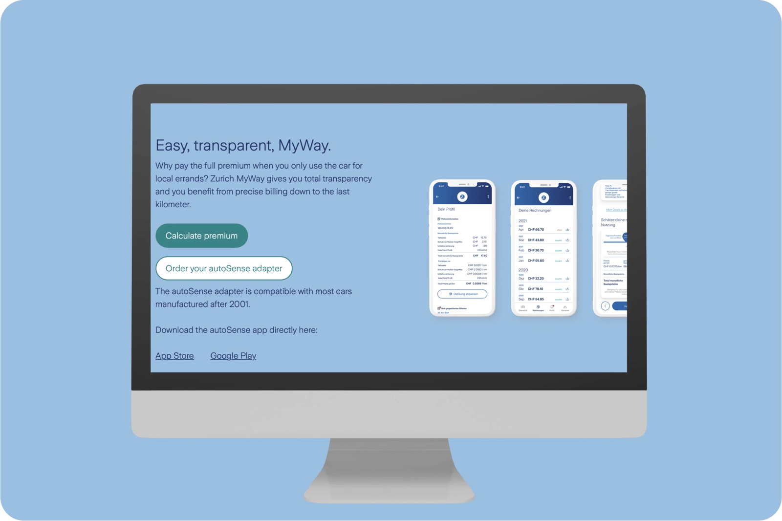
Zurich MyWay (Switzerland) offers a unique insurance service by enabling users to only pay for the distance driven and providing an easy and transparent billing process.
To answer the need for faster and more flexible small loans, Lydia, a French payment start-up, developed a loan service that enables customers to get a loan within 24 hours.

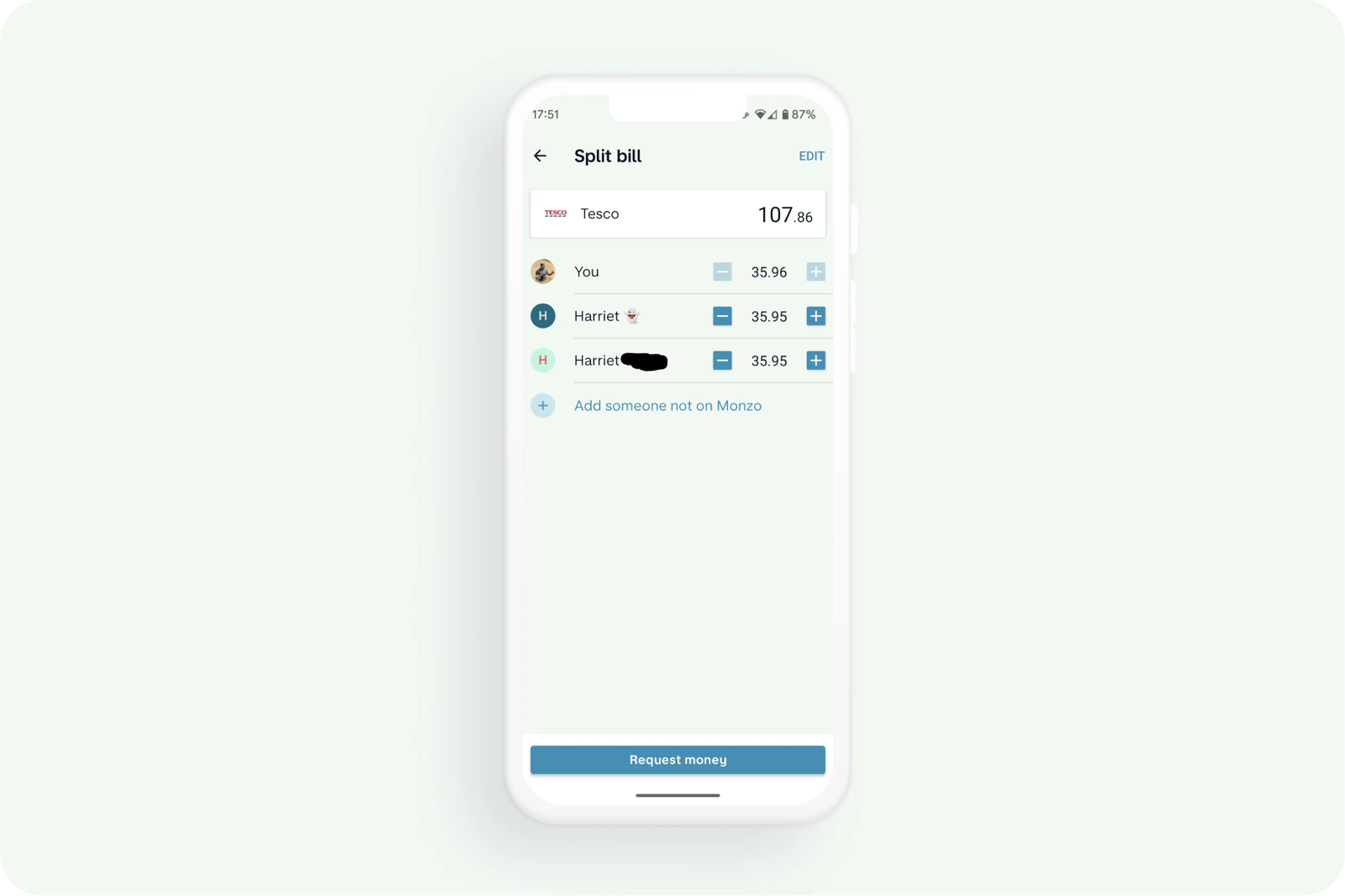
Before Monzo's 'split the bill' feature, splitting the restaurant bill with friends was a highly frustrating, manual affair.
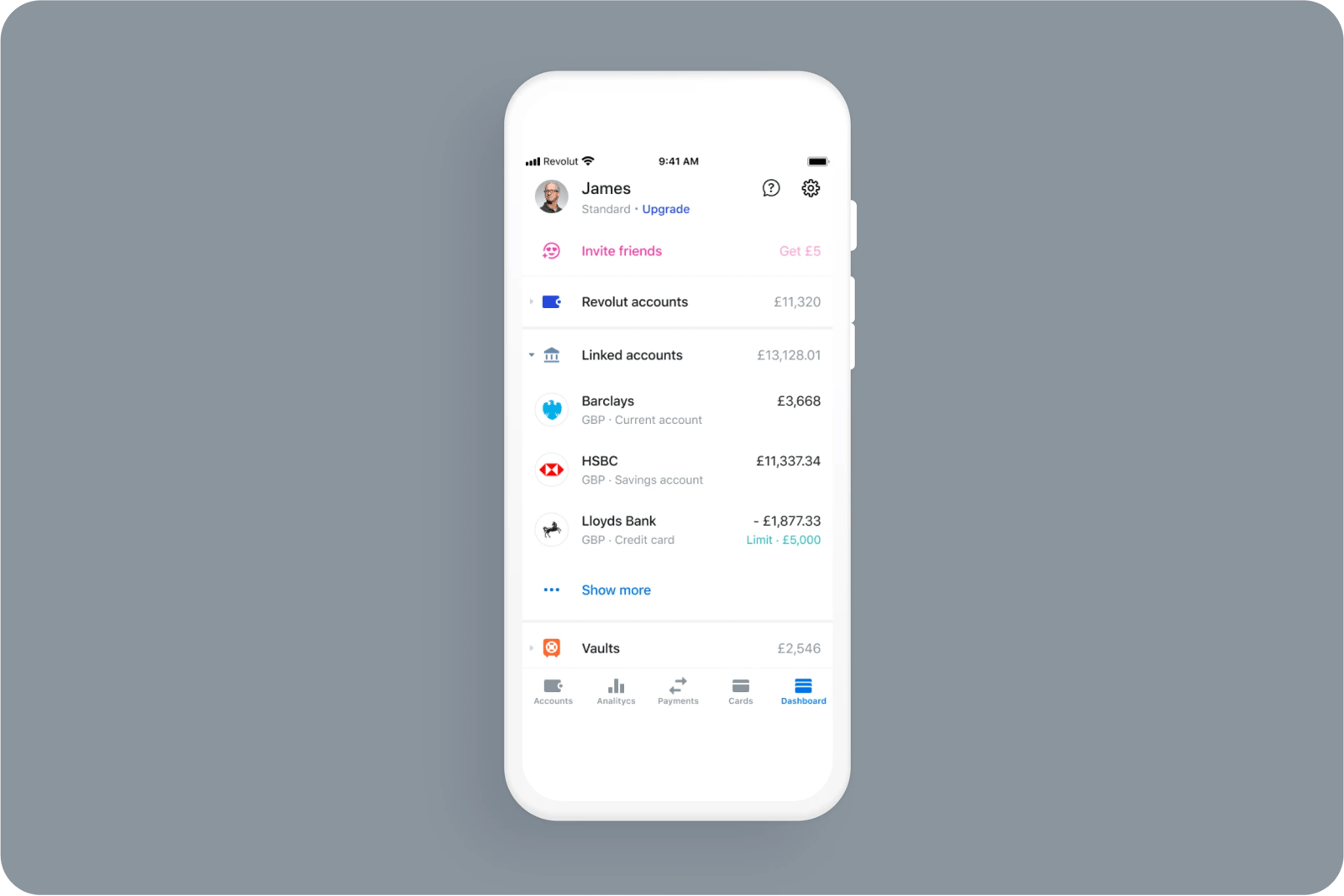
Revolut launched an open banking feature that gives customers the ability to manage their bank account and financial activities from the Revolut app.
What bad looks like
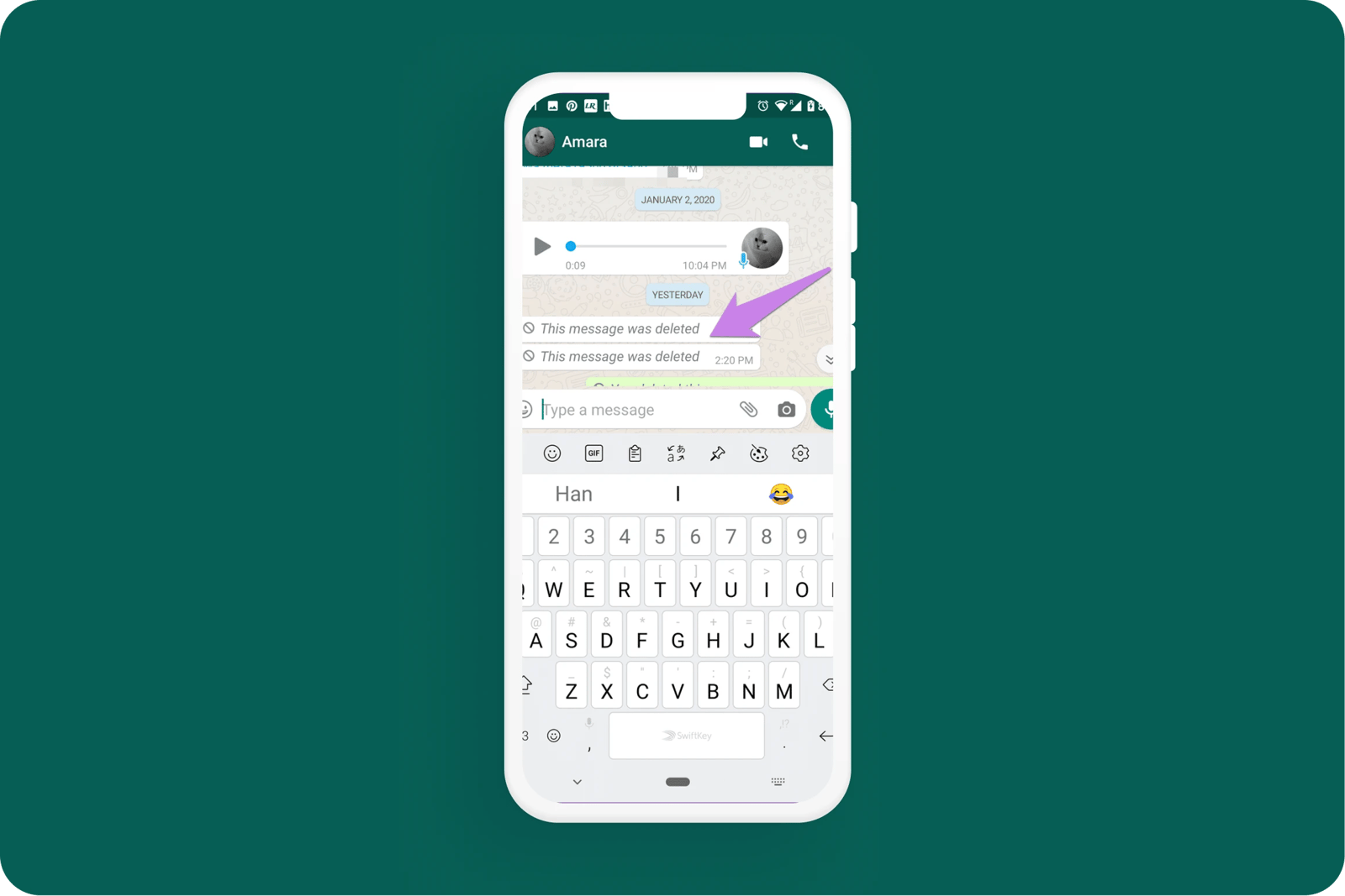
WhatsApp informs the recipient that the sender has deleted a message. This somewhat defeats the purpose of deleting it in the first place. In fact, this looks way more suspicious and is likely to prompt an awkward "why did you delete the message?" type of response.

Related CX Standards


All the categories
Straightforward
Fulfill fundamental user needs information is displayed in a clear and structured way, only showing what is necessary.
Flowing
Anticipate user behaviours and help users move through journeys.
.webp?iar=0&w=1600)
Distinctive
Offer a distinctive Zurich experience and promotes sustainable behaviours.

Supportive
Follow brand guidelines, presents up-to-date information and be transparent with customers.

Engaging
Present relevant content in a visually appealing and intriguing way.
Reliable
Follow brand guidelines, presents up-to-date information and be transparent with customers.
Contact us if:
-
You would like to add good and bad examples related to this principle.
-
You have some suggestions regarding the UX principle itself.
-
You would like to add some UX principles.
Email to cx@zurich.com.