Category : Supportive The 57 UX Principles are grouped under 6 categories (Straightforward/Flowing/Engaging/Distinctive/Supportive/Reliable). Each category describes an aspect of the Zurich User Experience.
Segmentation : Best Practice The Zurich Guidelines are divided into two categories: Uniquely Zurich (principles that are inspired by current projects and initiatives within Zurich and aim to push the user experience further) and Best Practice (principles that cover basic, yet essential guidelines to deliver a good UX experience).
UX Principle number : SU07 The UX Principle number is unique to each principle. It can be used for referencing, listing, etc..
Applicable if you are designing:
Screen A single view or page within a digital product or application.
Product A tangible or digital offering that is designed and developed to fulfill specific user needs or solve problems.
Journey A path or series of steps that a user takes when interacting with a product or service to reach a goal/complete a task.
Ecosystem It refers to the broader context and interconnections surrounding a product or service. It involves the various touchpoints, channels, and interactions that users have with the product, as well as the supporting infrastructure, technologies, and external factors that influence the overall user experience.
Example
What good looks like
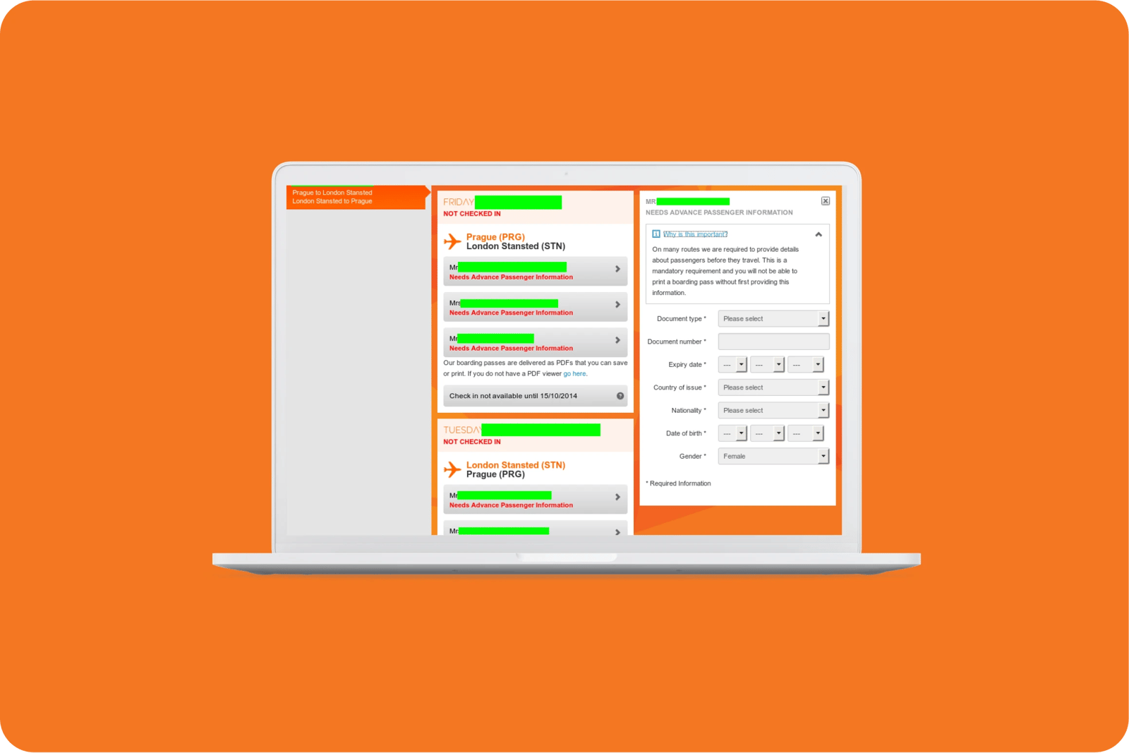
EasyJet explains why they need customers' information to complete the online checking above the information form.
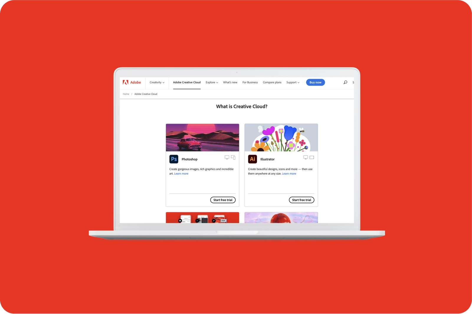
Adobe explains in simple language the purpose and benefits of each product without overloading users with masses of information.
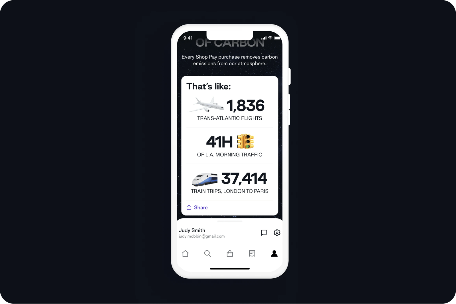
Shop Pay app uses widely understood reference points to make hard-to-understand carbon emissions data more accessible and understandable. The clever use of emojis makes the experience more relatable and quickly understandable for a range of audiences.
Mural explains to users the function of each tool, below the tool name. This gives clear guidance and clarity over sub sections of information.
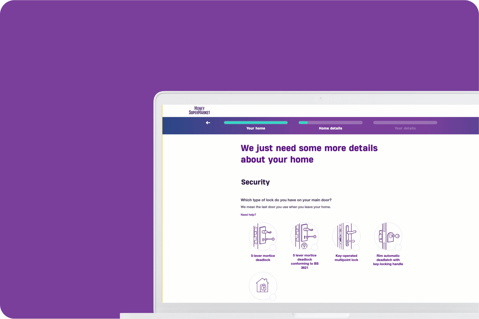
MoneySuperMarket provides visual references for abstract information/data such as the different types of door handles which makes for a more engaging experience.
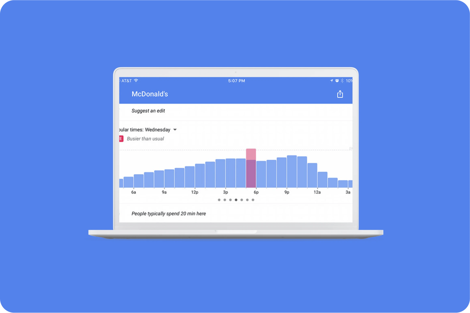
Google Maps provide live updates in addition to usual popular times regarding the business of a place before you head there.
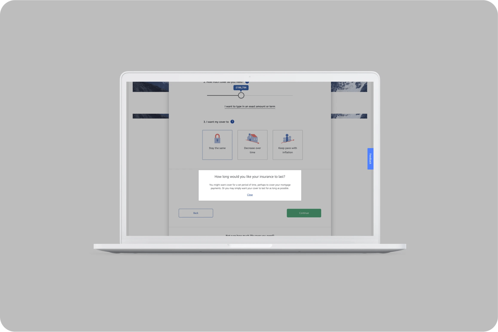
Zurich UK uses tooltips to explain insurance terms in a 'human way' using simple language during the quote process.
Uber manages to present very different value propositions next to each other, through clean and simple design, concise copy and stripping away all other distractions.
What bad looks like
Halifax provides a 'invest for the future’ CTA on the homepage which leads to an assumptive investment page which doesn't break down its actual purpose for customers.


Related CX Standards


All the categories
Straightforward
Fulfill fundamental user needs information is displayed in a clear and structured way, only showing what is necessary.
Flowing
Anticipate user behaviours and help users move through journeys.
.webp?iar=0&w=1600)
Distinctive
Offer a distinctive Zurich experience and promotes sustainable behaviours.

Supportive
Follow brand guidelines, presents up-to-date information and be transparent with customers.

Engaging
Present relevant content in a visually appealing and intriguing way.

Reliable
Follow brand guidelines, presents up-to-date information and be transparent with customers.
Contact us if:
-
You would like to add good and bad examples related to this principle.
-
You have some suggestions regarding the UX principle itself.
-
You would like to add some UX principles.
Email to cx@zurich.com.