Category : Straightforward The 57 UX Principles are grouped under 6 categories (Straightforward/Flowing/Engaging/Distinctive/Supportive/Reliable). Each category describes an aspect of the Zurich User Experience.
Segmentation : Best Practice The Zurich Guidelines are divided into two categories: Uniquely Zurich (principles that are inspired by current projects and initiatives within Zurich and aim to push the user experience further) and Best Practice (principles that cover basic, yet essential guidelines to deliver a good UX experience).
UX Principle number : ST07 The UX Principle number is unique to each principle. It can be used for referencing, listing, etc..
Applicable if you are designing:
Screen A single view or page within a digital product or application.
Product A tangible or digital offering that is designed and developed to fulfill specific user needs or solve problems.
Journey A path or series of steps that a user takes when interacting with a product or service to reach a goal/complete a task.
Ecosystem It refers to the broader context and interconnections surrounding a product or service. It involves the various touchpoints, channels, and interactions that users have with the product, as well as the supporting infrastructure, technologies, and external factors that influence the overall user experience.
Example
What good looks like
If it thinks you might have made a mistake, Google shows the results for what it thinks you intended, with a simple CTA to show results for your exact entry which demonstrates excellent problem-solving skills.

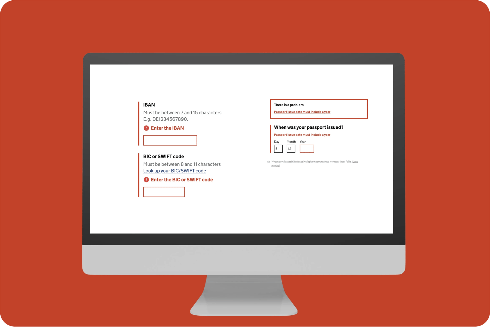
UK Gov website has very clear, obvious and descriptive error messages - that help the user get it right.
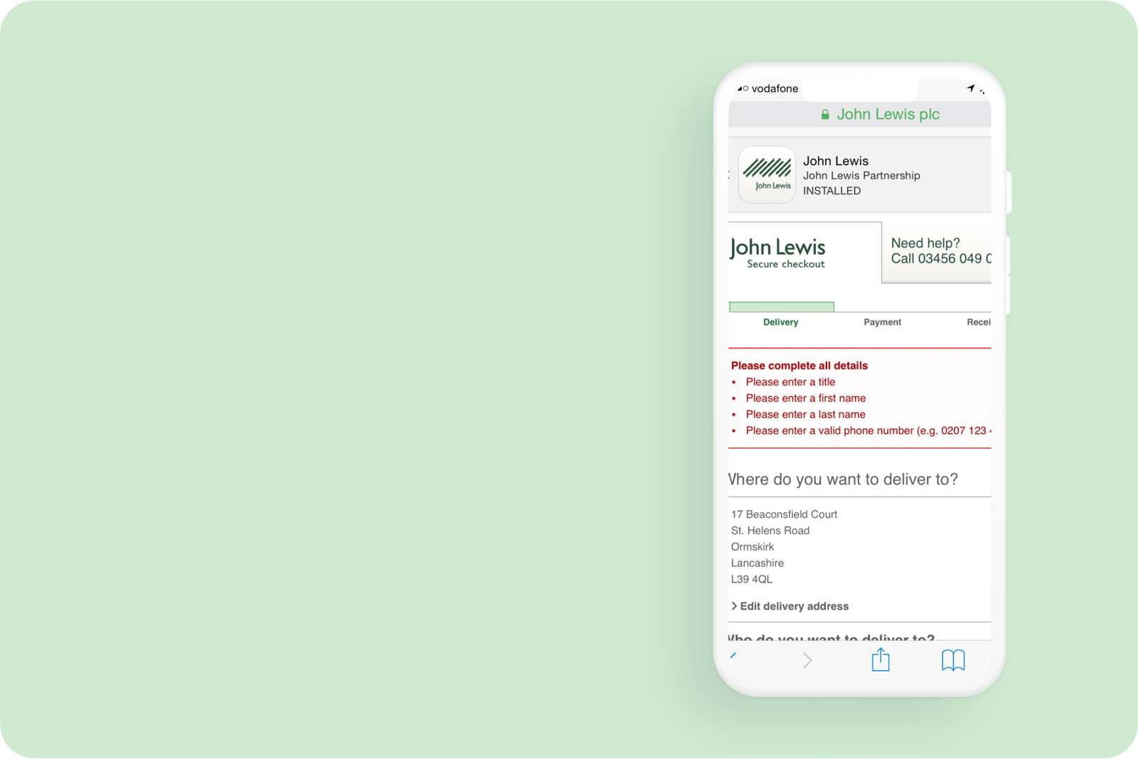
When you click the ‘continue’ button on a John Lewis form it outlines all of the errors on the page for you to address before progressing.
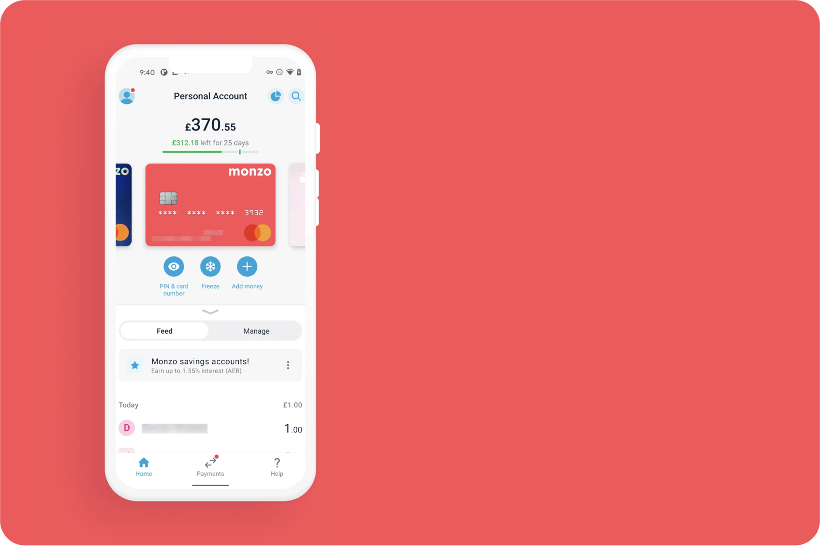
When a customer freezes their Monzo debit/credit card, the visual changes to illustrate the user's action which acts as a subtle reminder in the event the customer has become unaware.
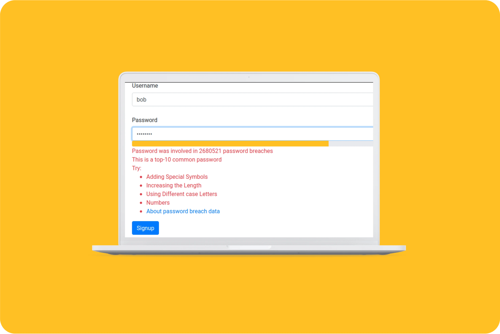
When users set passwords tell them how to create a strong one, and the risks of not doing so which in turn helps reduce the level of potential fraud.
What bad looks like
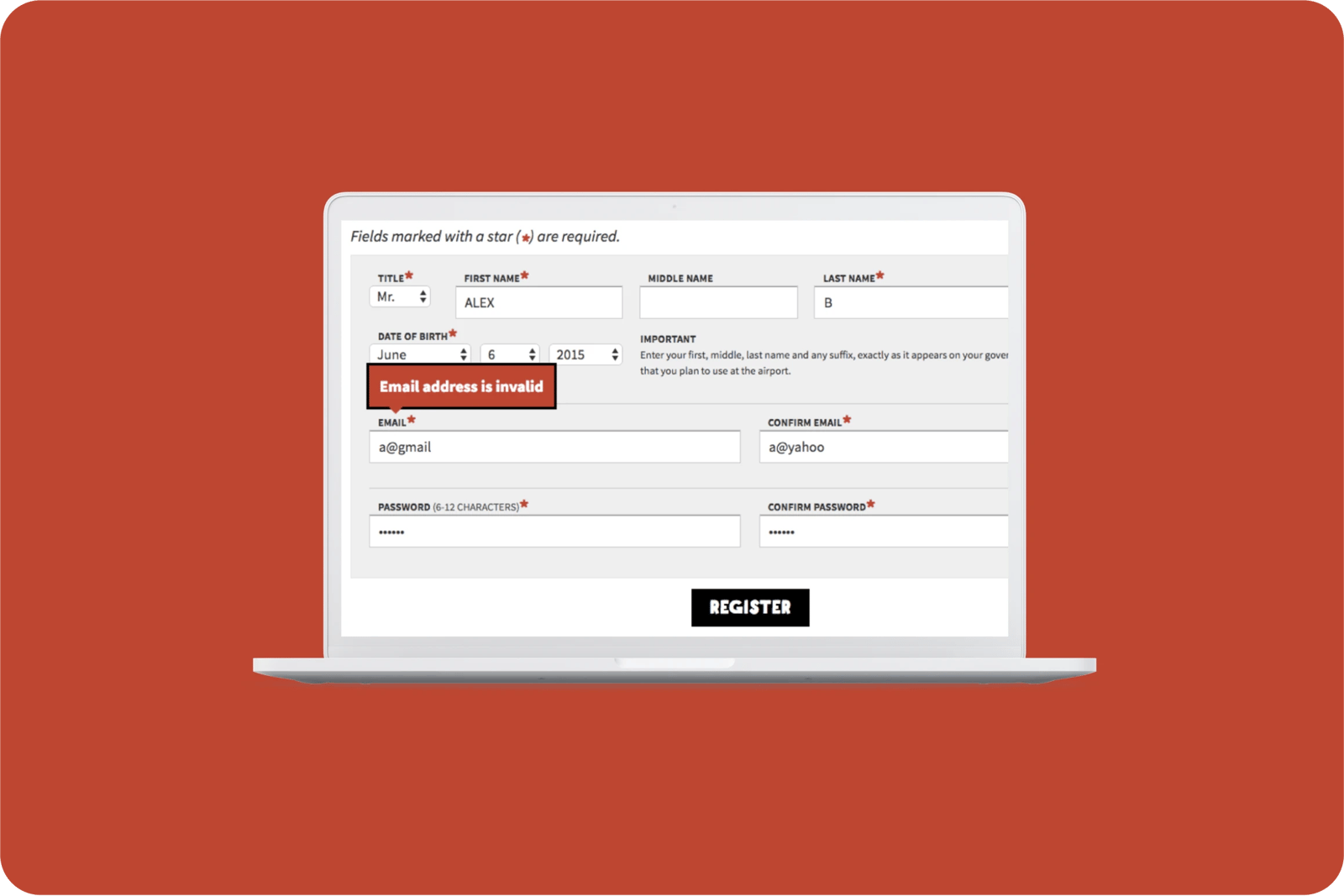
Spirit Airline's error message lacks clarity; it doesn't say what is wrong with the email address and how the user can rectify the mistake.
All the categories
Contact us if:
-
You would like to add good and bad examples related to this principle.
-
You have some suggestions regarding the UX principle itself.
-
You would like to add some UX principles.
Email to cx@zurich.com.


.webp?iar=0&w=1600)


