Category : Reliable The 57 UX Principles are grouped under 6 categories (Straightforward/Flowing/Engaging/Distinctive/Supportive/Reliable). Each category describes an aspect of the Zurich User Experience.
Segmentation : Uniquely Zurich The Zurich Guidelines are divided into two categories: Uniquely Zurich (principles that are inspired by current projects and initiatives within Zurich and aim to push the user experience further) and Best Practice (principles that cover basic, yet essential guidelines to deliver a good UX experience).
UX Principle number : RL03 The UX Principle number is unique to each principle. It can be used for referencing, listing, etc..
Applicable if you are designing:
Screen A single view or page within a digital product or application.
Product A tangible or digital offering that is designed and developed to fulfill specific user needs or solve problems.
Journey A path or series of steps that a user takes when interacting with a product or service to reach a goal/complete a task.
Ecosystem It refers to the broader context and interconnections surrounding a product or service. It involves the various touchpoints, channels, and interactions that users have with the product, as well as the supporting infrastructure, technologies, and external factors that influence the overall user experience.
Example
What good looks like
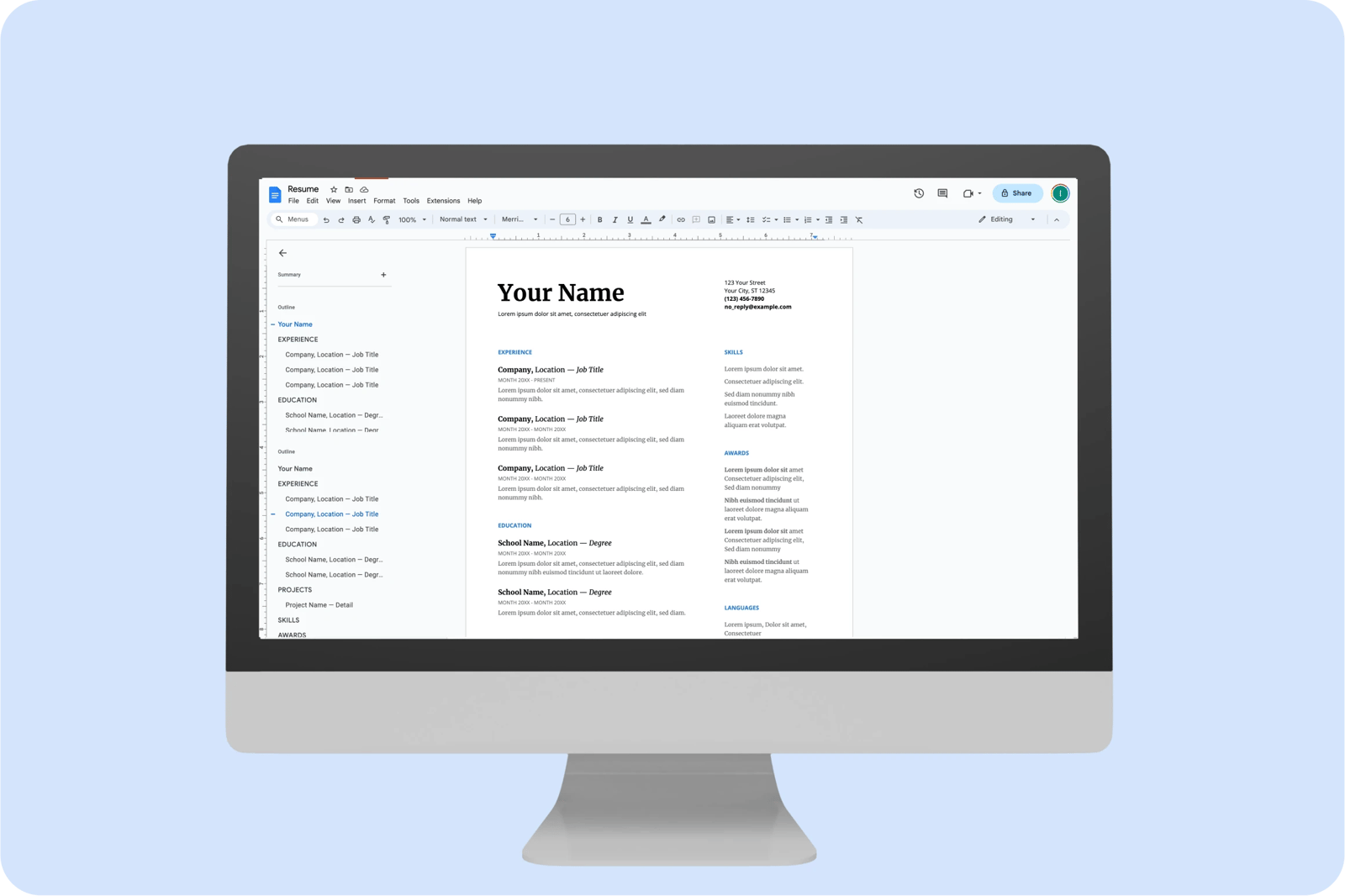
Google Drive enables the user to see live edits and access live documents. Documents are constantly updated on all accounts, platforms and devices.
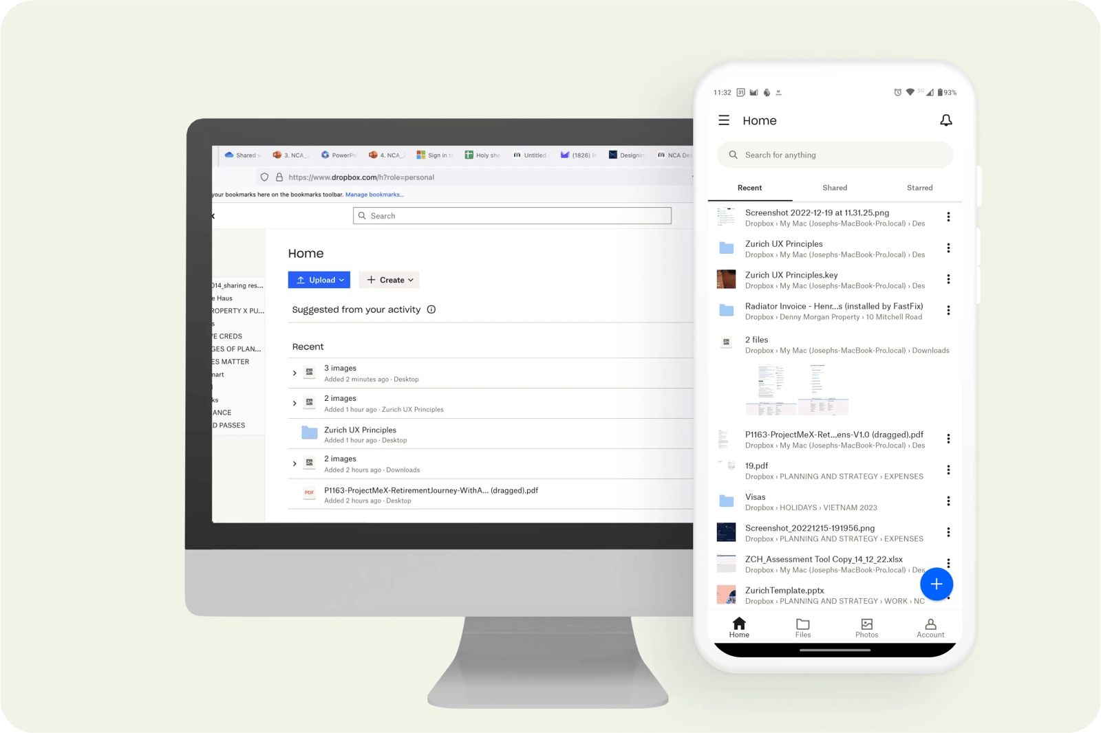
When making changes in Dropbox, they appear instantly across the website, desktop app and mobile app. Telling the user when they happened and who made them, and on which device.
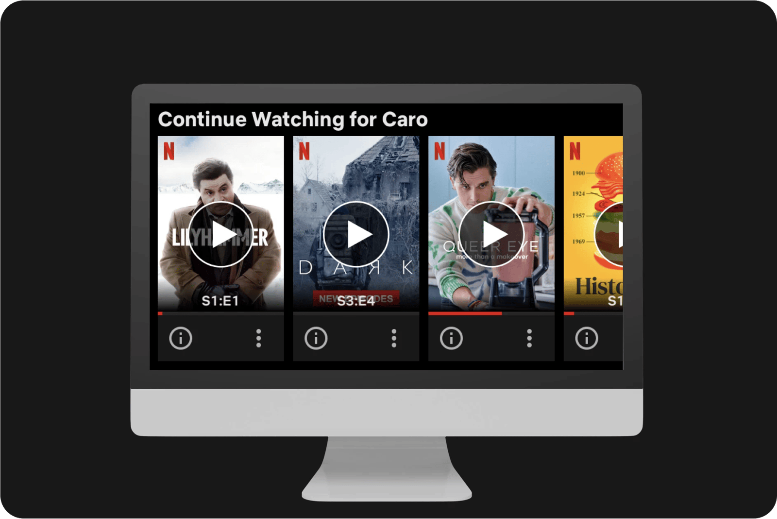
Netflix updates the user's profile with things they watched /are watching on all the channels (app and desktop).
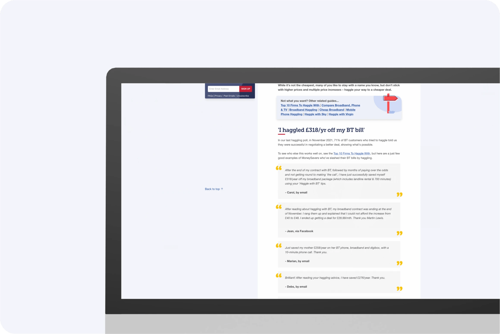
On MoneySavingExpert consumers are told to call up and haggle with companies to get a better deal. This should not be the case with Zurich.
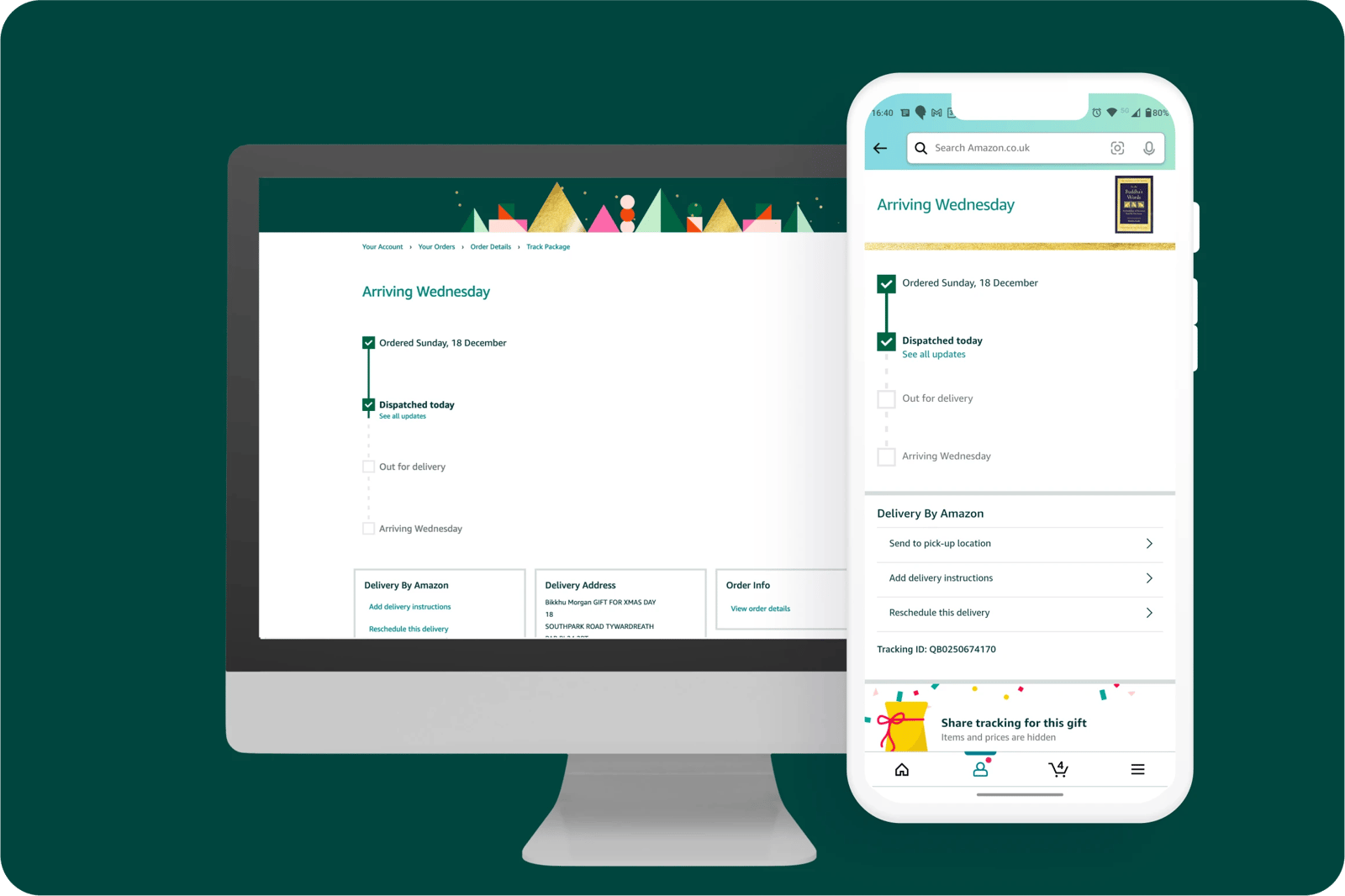
Information across the Amazon mobile app and website both provide the exact same information which stops customers from being confused between different devise experiences.
What bad looks like
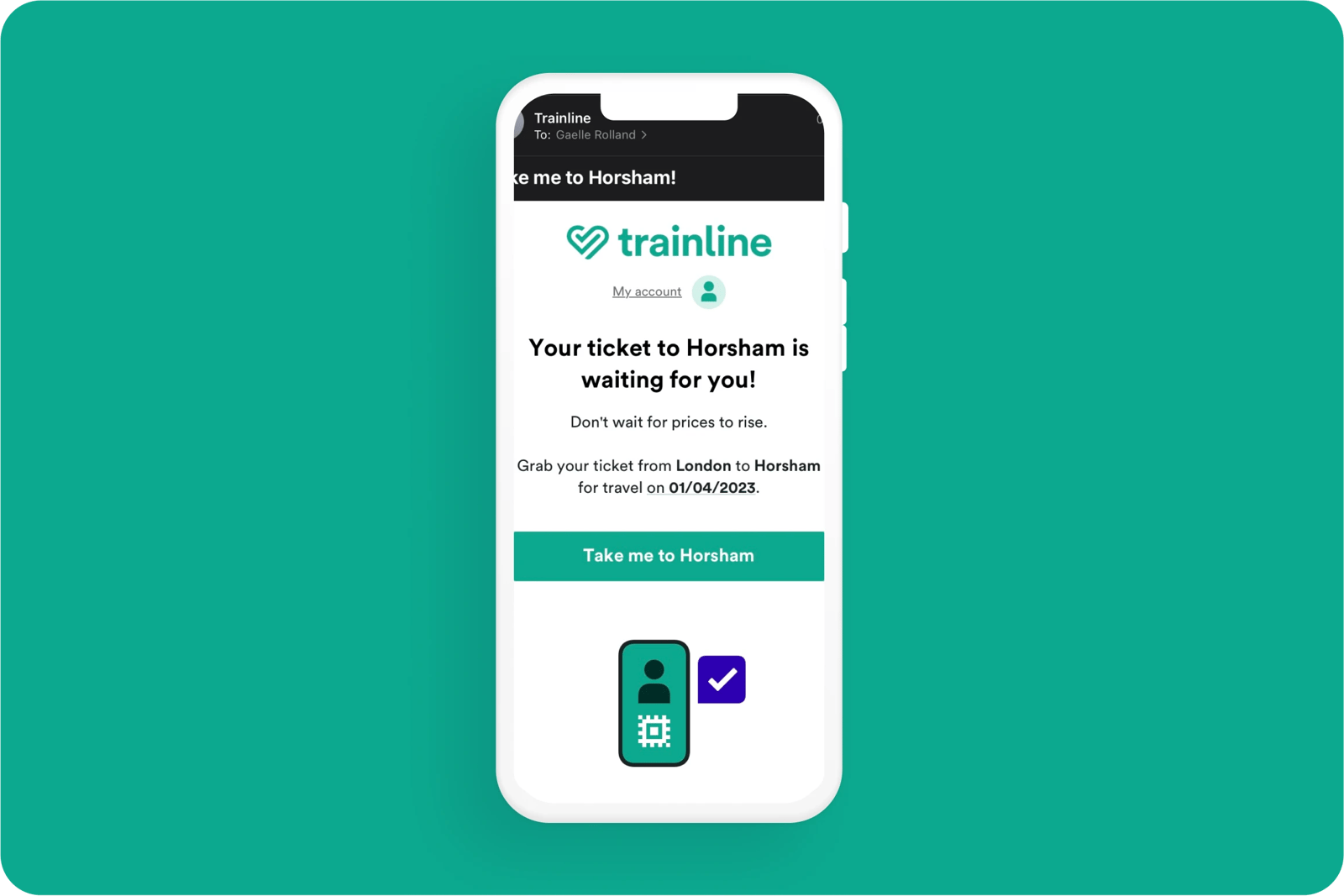
Trainline sends emails to users to continue their purchase after the ticket purchase was already made, creating confusion for customers.

Related CX Standards


All the categories
Straightforward
Fulfill fundamental user needs information is displayed in a clear and structured way, only showing what is necessary.
Flowing
Anticipate user behaviours and help users move through journeys.
.webp?iar=0&w=1600)
Distinctive
Offer a distinctive Zurich experience and promotes sustainable behaviours.

Supportive
Follow brand guidelines, presents up-to-date information and be transparent with customers.

Engaging
Present relevant content in a visually appealing and intriguing way.

Reliable
Follow brand guidelines, presents up-to-date information and be transparent with customers.
Contact us if:
-
You would like to add good and bad examples related to this principle.
-
You have some suggestions regarding the UX principle itself.
-
You would like to add some UX principles.
Email to cx@zurich.com.