Category : Flowing The 57 UX Principles are grouped under 6 categories (Straightforward/Flowing/Engaging/Distinctive/Supportive/Reliable). Each category describes an aspect of the Zurich User Experience.
Segmentation : Best Practice The Zurich Guidelines are divided into two categories: Uniquely Zurich (principles that are inspired by current projects and initiatives within Zurich and aim to push the user experience further) and Best Practice (principles that cover basic, yet essential guidelines to deliver a good UX experience).
UX Principle number : FL04 The UX Principle number is unique to each principle. It can be used for referencing, listing, etc..
Applicable if you are designing:
Screen A single view or page within a digital product or application.
Product A tangible or digital offering that is designed and developed to fulfill specific user needs or solve problems.
Journey A path or series of steps that a user takes when interacting with a product or service to reach a goal/complete a task.
Ecosystem It refers to the broader context and interconnections surrounding a product or service. It involves the various touchpoints, channels, and interactions that users have with the product, as well as the supporting infrastructure, technologies, and external factors that influence the overall user experience.
Example
What good looks like
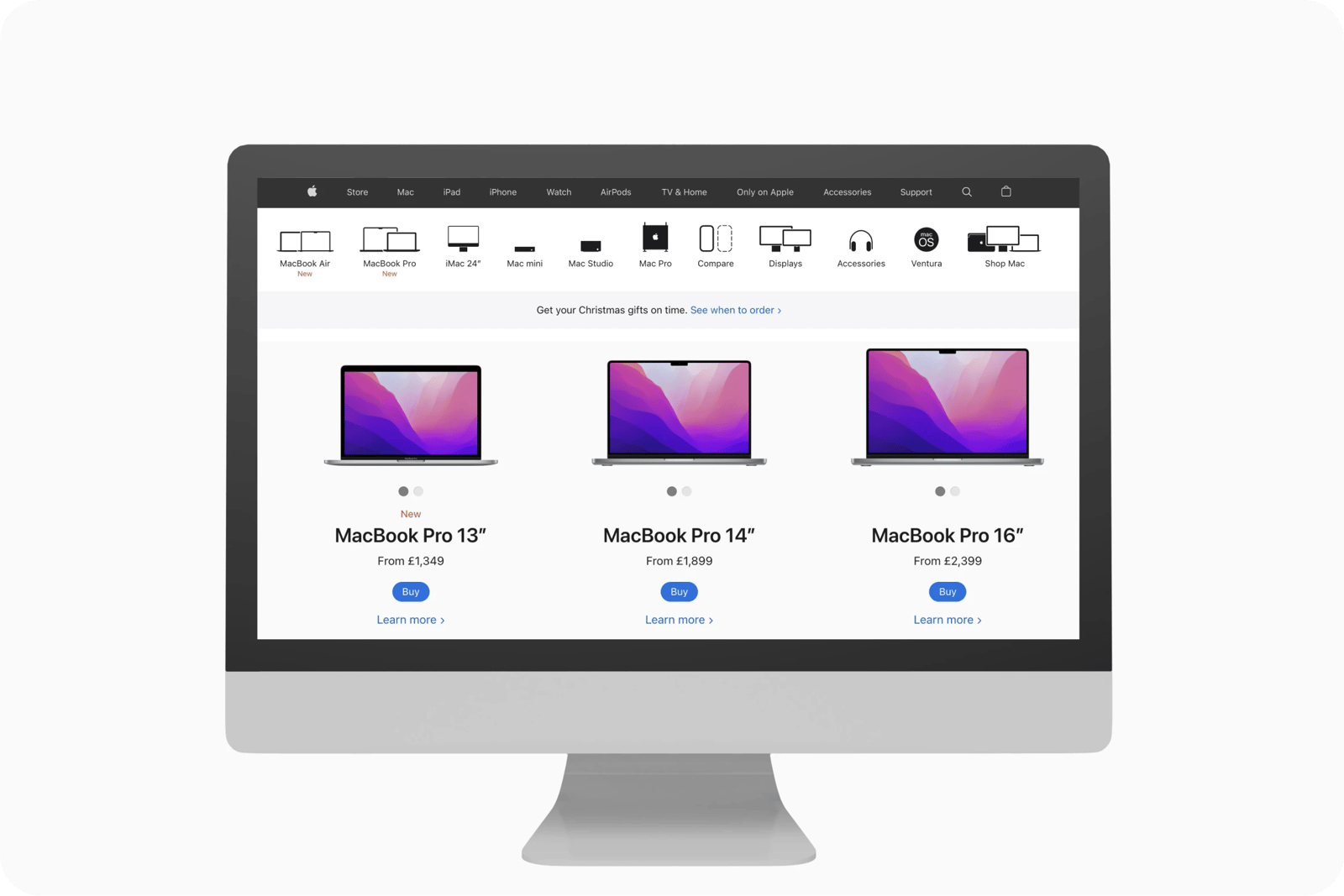
Apple uses simple functional names to describe what the products are and allow the user to confidently choose which one they want.
On the Easyjet website, the name of the buttons describes the content of the page.

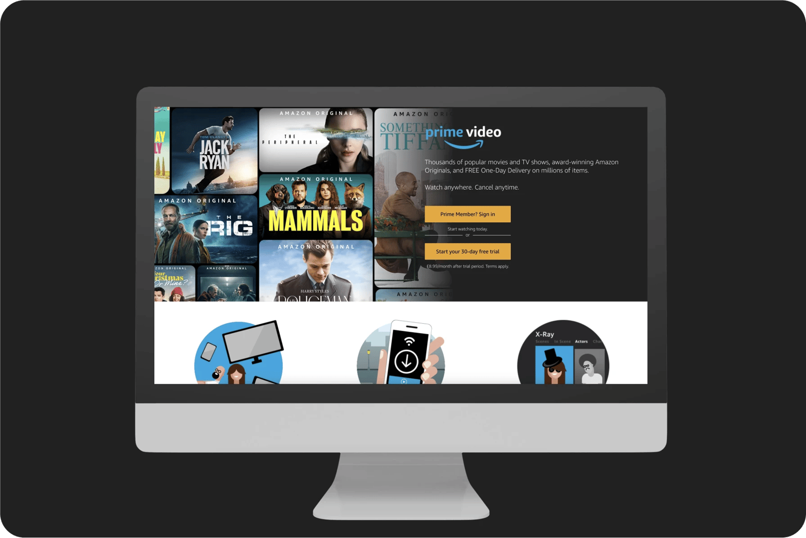
Amazon’s CTAs are descriptive and have high info scent copy which provides a quick snapshot of the product offering to customers.
Wikipedia interactive elements are coloured in blue and display a preview of the page content when the pointer hovers over the interactive element.

What bad looks like
Lenovo uses abstract product names and marketing-speak that leave the user not knowing what the differences are between the options or which one to choose.

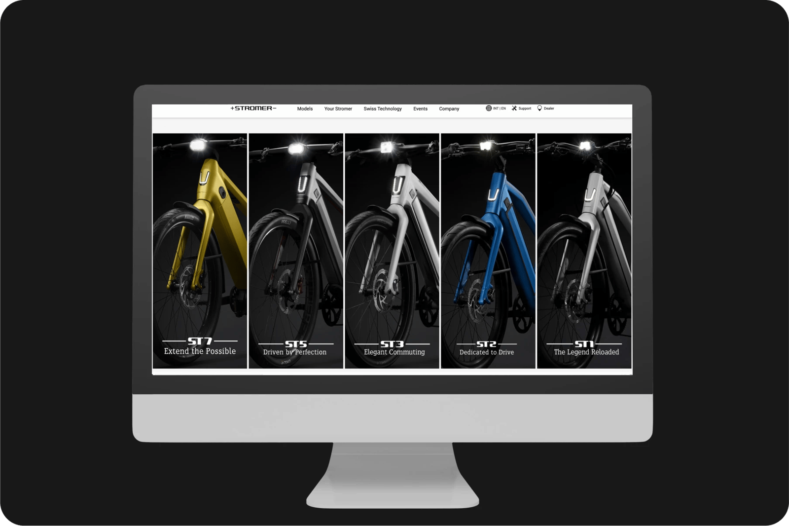
The Stromer website uses marketing fluff to describe its products, instead of providing the salient attributes users would need to know to choose one.
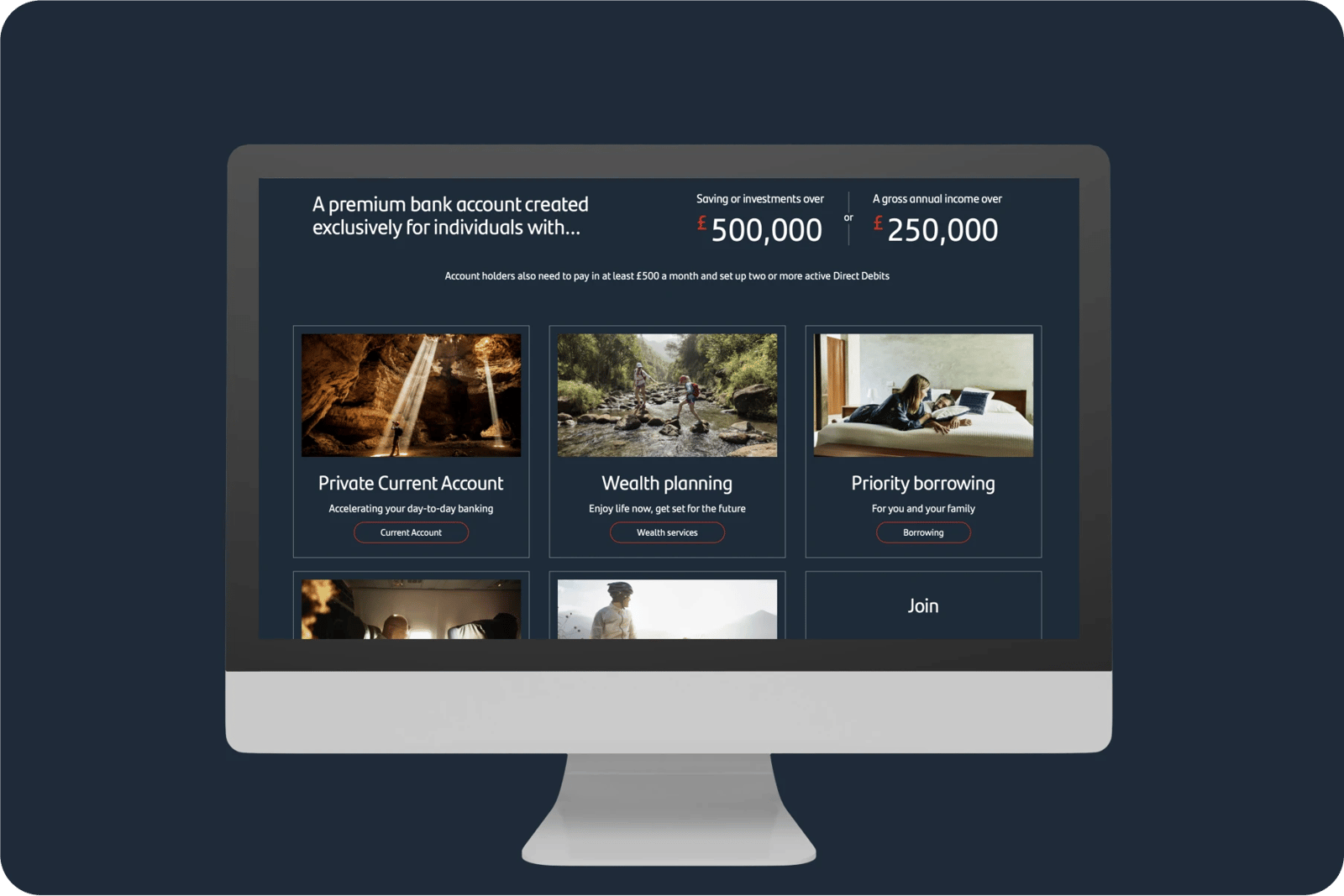
Santander uses generic imagery and marketing-speak in support copy instead of functional descriptors telling you what wealth planning is, priority borrowing, etc.
Cisco uses many branded terms in their headlines that people are not familiar with and will probably not understand.


Related CX Standards


All the categories

Straightforward
Fulfill fundamental user needs information is displayed in a clear and structured way, only showing what is necessary.

Flowing
Anticipate user behaviours and help users move through journeys.
.webp?iar=0&w=1600)
Distinctive
Offer a distinctive Zurich experience and promotes sustainable behaviours.

Supportive
Follow brand guidelines, presents up-to-date information and be transparent with customers.

Engaging
Present relevant content in a visually appealing and intriguing way.

Reliable
Follow brand guidelines, presents up-to-date information and be transparent with customers.
Contact us if:
-
You would like to add good and bad examples related to this principle.
-
You have some suggestions regarding the UX principle itself.
-
You would like to add some UX principles.
Email to cx@zurich.com.