Category : Flowing The 57 UX Principles are grouped under 6 categories (Straightforward/Flowing/Engaging/Distinctive/Supportive/Reliable). Each category describes an aspect of the Zurich User Experience.
Segmentation : Best Practice The Zurich Guidelines are divided into two categories: Uniquely Zurich (principles that are inspired by current projects and initiatives within Zurich and aim to push the user experience further) and Best Practice (principles that cover basic, yet essential guidelines to deliver a good UX experience).
UX Principle number : FL03 The UX Principle number is unique to each principle. It can be used for referencing, listing, etc..
Applicable if you are designing:
Screen A single view or page within a digital product or application.
Product A tangible or digital offering that is designed and developed to fulfill specific user needs or solve problems.
Journey A path or series of steps that a user takes when interacting with a product or service to reach a goal/complete a task.
Ecosystem It refers to the broader context and interconnections surrounding a product or service. It involves the various touchpoints, channels, and interactions that users have with the product, as well as the supporting infrastructure, technologies, and external factors that influence the overall user experience.
Example
What good looks like
UCLA Health uses a variety of different components and modules to clearly signpost different content / journeys.

Booking.com provides to customers different ways to look for what they need (straightforward navigation menu, searching tool with search examples, categories of 'products / services).

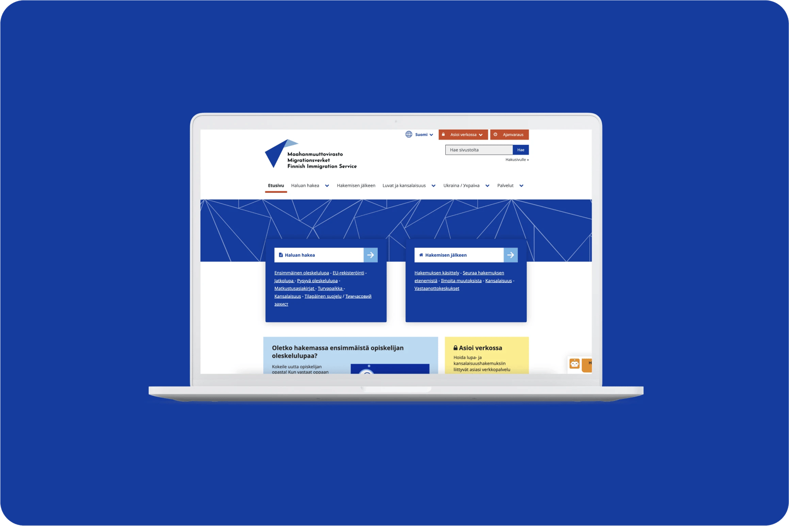
MIGRI (Finish Immigration Services) use key steps of the journey as labels for navigation.
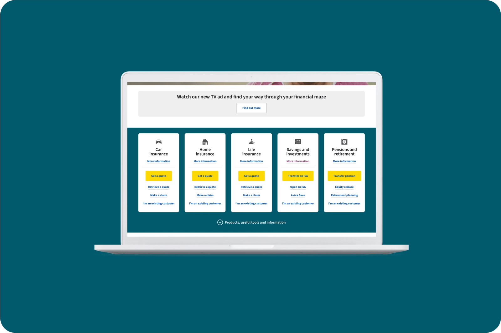
Aviva uses the homepage to direct customers to key pages (getting a quote, customer's space etc) using CTAs.
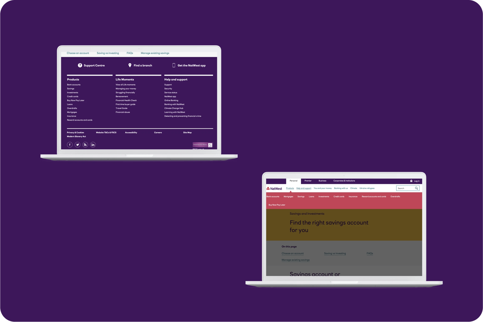
NatWest links to important areas of the site in the navigation, page content, and footer.
Santander uses anchor links so people can skip to the bit that's relevant. They also have a Related Content panel.

What bad looks like
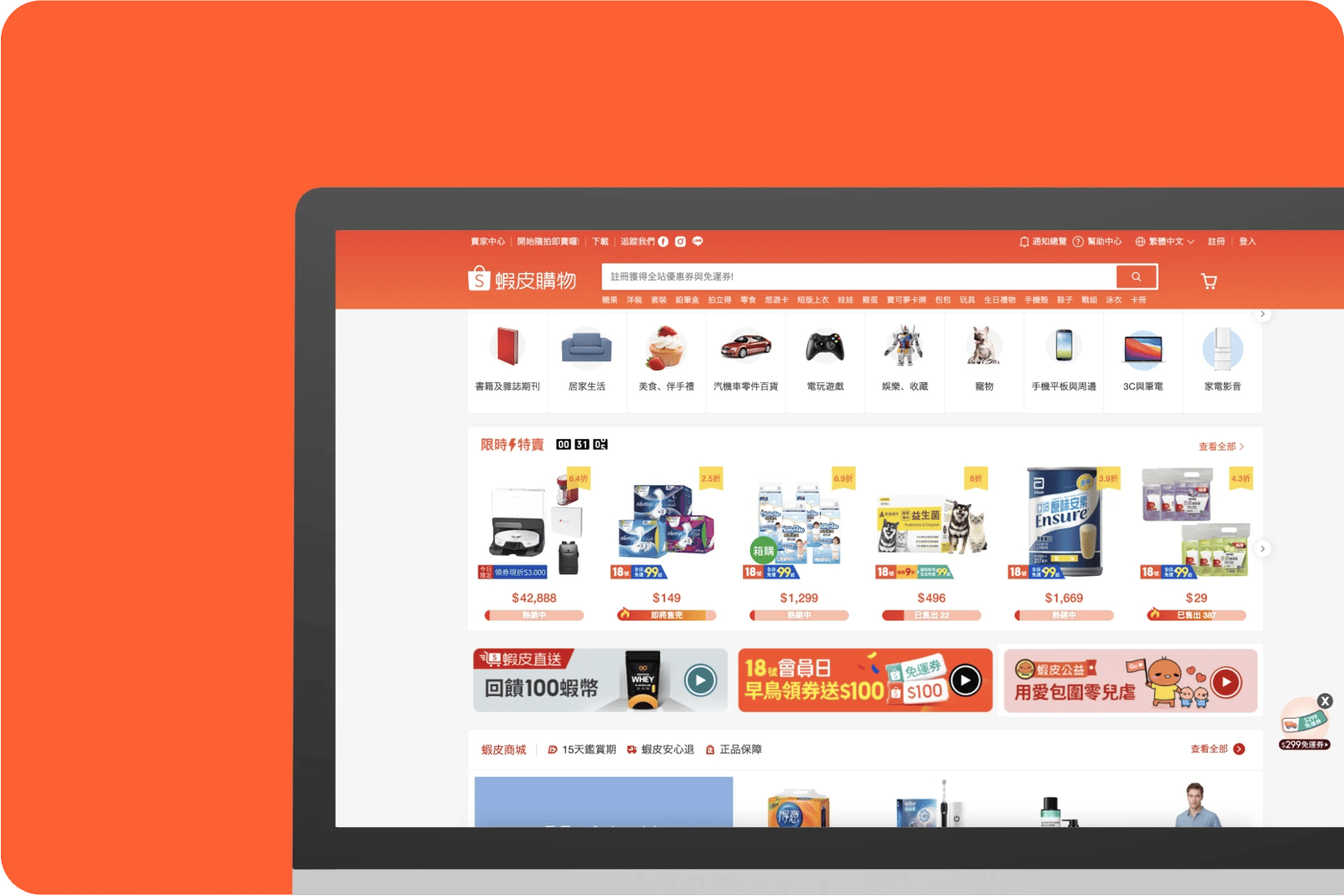
Shopee has menus on multiple sides of the page, and 26 categories of products, creating overload information and making it hard for users to find the products/information they want.
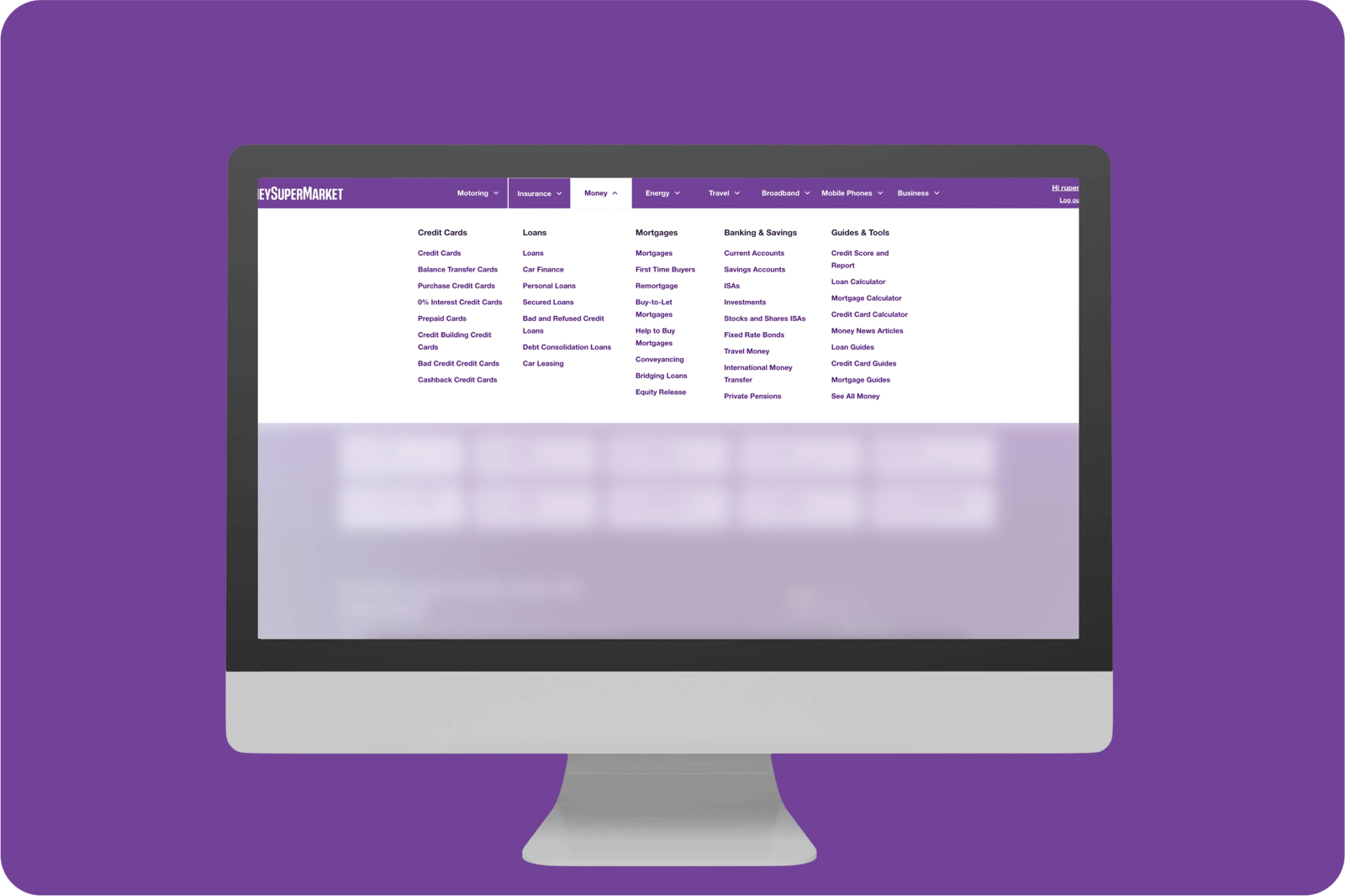
MoneySuperMarket dropdown menus are overloaded with information, making it hard to find the information you are looking for and remember the journey to get to a specific page.
Amazon put interstitial upsells for Prime in the middle of the checkout, regardless of how many times you've said no before. They also set the defaults to sign up and hide the 'no thank you' messaging, so people accidentally sign up without realising.

Neilpatel interrupts the natural flow by using too many callouts to visit other pages and intrusive interstitials (pop-ups).

Barclays' homepage is overloaded with shortcuts and hyperlinks which can lead to unnecessary duplication and confusing orientation.


Related CX Standards


All the categories

Straightforward
Fulfill fundamental user needs information is displayed in a clear and structured way, only showing what is necessary.

Flowing
Anticipate user behaviours and help users move through journeys.
.webp?iar=0&w=1600)
Distinctive
Offer a distinctive Zurich experience and promotes sustainable behaviours.

Supportive
Follow brand guidelines, presents up-to-date information and be transparent with customers.

Engaging
Present relevant content in a visually appealing and intriguing way.

Reliable
Follow brand guidelines, presents up-to-date information and be transparent with customers.
Contact us if:
-
You would like to add good and bad examples related to this principle.
-
You have some suggestions regarding the UX principle itself.
-
You would like to add some UX principles.
Email to cx@zurich.com.