Category : Flowing The 57 UX Principles are grouped under 6 categories (Straightforward/Flowing/Engaging/Distinctive/Supportive/Reliable). Each category describes an aspect of the Zurich User Experience.
Segmentation : Best Practice The Zurich Guidelines are divided into two categories: Uniquely Zurich (principles that are inspired by current projects and initiatives within Zurich and aim to push the user experience further) and Best Practice (principles that cover basic, yet essential guidelines to deliver a good UX experience).
UX Principle number : FL01 The UX Principle number is unique to each principle. It can be used for referencing, listing, etc..
Applicable if you are designing:
Screen A single view or page within a digital product or application.
Product A tangible or digital offering that is designed and developed to fulfill specific user needs or solve problems.
Journey A path or series of steps that a user takes when interacting with a product or service to reach a goal/complete a task.
Ecosystem It refers to the broader context and interconnections surrounding a product or service. It involves the various touchpoints, channels, and interactions that users have with the product, as well as the supporting infrastructure, technologies, and external factors that influence the overall user experience.
Example
What good looks like
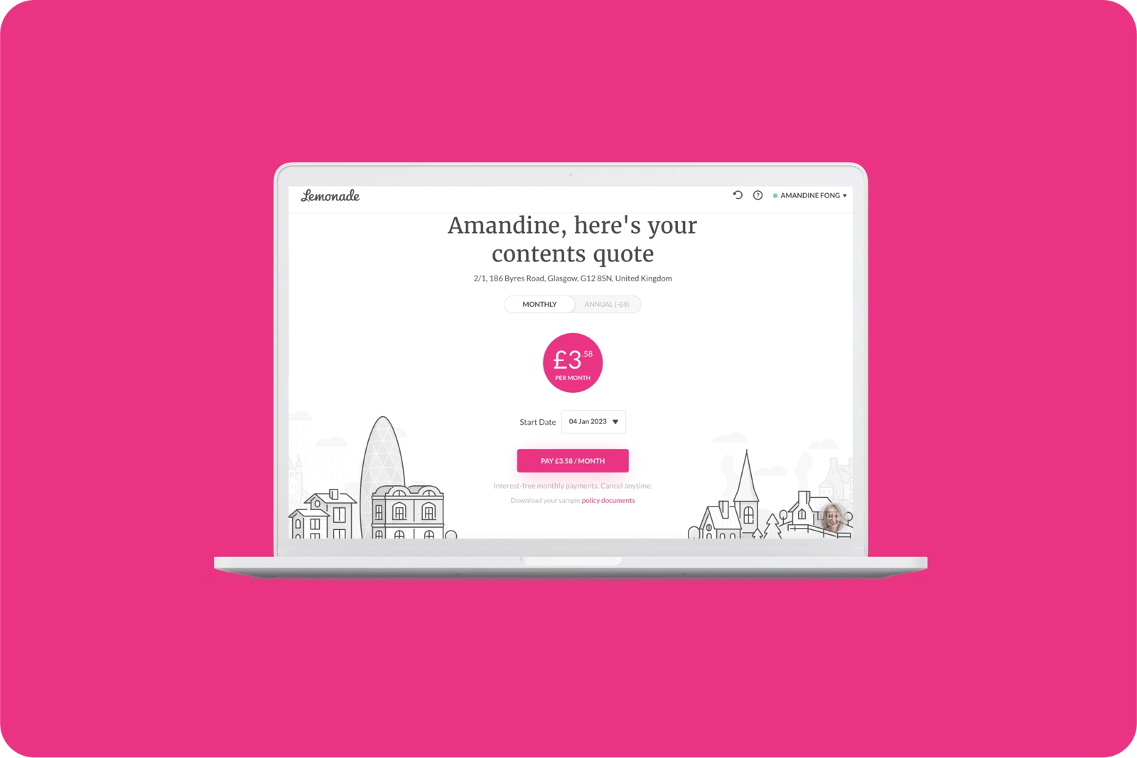
Lemonade offers you only few interaction options: subscribe to the insurance, see your monthly / annual fee, or add things to your insurance.
When pausing your notifications, slack provides a series of common options as defaults to prevent typing errors.

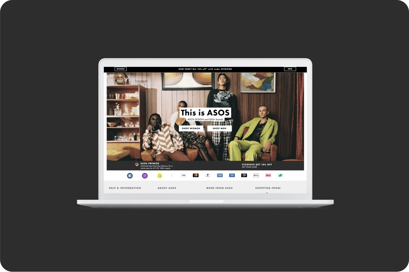
Asos's landing page presents only two categories of products: woman and men. This limits user journeys and ands confusion.
What bad looks like
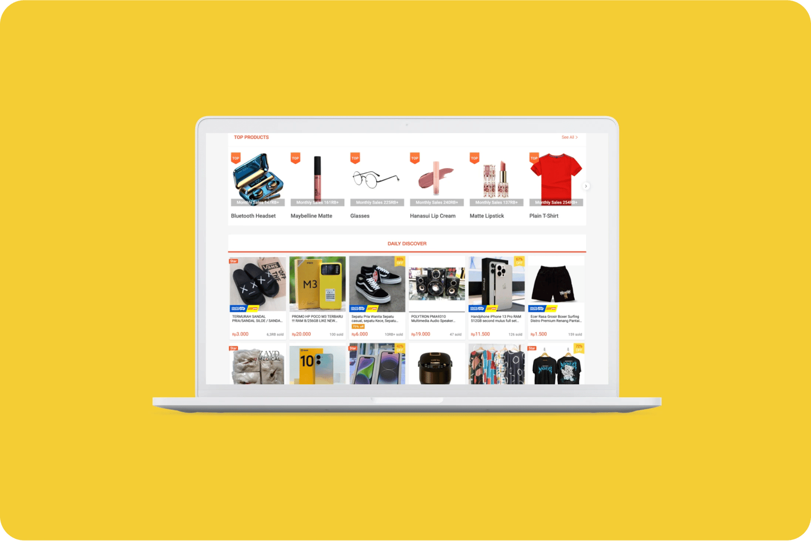
One of Shopee's filters offers a range of 500+, which doesn't limit the number of products the user will have to go through.
Glasgow City Council's pages provide users with a long list of options, leading to different pages. It is hard to remember how to get to a specific page / retrace your steps and it is easy to get lost.

All the categories
Contact us if:
-
You would like to add good and bad examples related to this principle.
-
You have some suggestions regarding the UX principle itself.
-
You would like to add some UX principles.
Email to cx@zurich.com.



.webp?iar=0&w=1600)


