Category : Engaging The 57 UX Principles are grouped under 6 categories (Straightforward/Flowing/Engaging/Distinctive/Supportive/Reliable). Each category describes an aspect of the Zurich User Experience.
Segmentation : Uniquely Zurich The Zurich Guidelines are divided into two categories: Uniquely Zurich (principles that are inspired by current projects and initiatives within Zurich and aim to push the user experience further) and Best Practice (principles that cover basic, yet essential guidelines to deliver a good UX experience).
UX Principle number : EN03 The UX Principle number is unique to each principle. It can be used for referencing, listing, etc..
Applicable if you are designing:
Screen A single view or page within a digital product or application.
Product A tangible or digital offering that is designed and developed to fulfill specific user needs or solve problems.
Journey A path or series of steps that a user takes when interacting with a product or service to reach a goal/complete a task.
Ecosystem It refers to the broader context and interconnections surrounding a product or service. It involves the various touchpoints, channels, and interactions that users have with the product, as well as the supporting infrastructure, technologies, and external factors that influence the overall user experience.
Example
What good looks like
In 2014, Google developed a little game that people could launch when they are not connected to the Internet and couldn’t navigate a web page, transforming this moment of frustration into a moment of delight.

After spending some time giving information about yourself, Chewy presents you with a beautifully constructed set of results celebrating your pet.

When receiving verification codes by SMS, iPhone recognises it automatically and pre-fills the text for you.

Some apps like Deliveroo enable you to scan credit cards to automatically extract data from them.

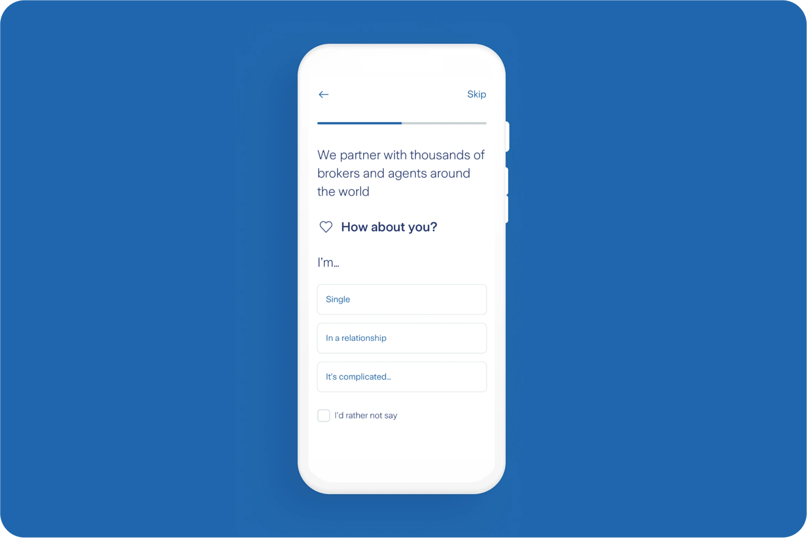
Zurich One shares some information about Zurich itself when asking for personal details from customers.

What bad looks like
Zara fails to provide basic product imagery in the basket preview page leaving customers confused about what they may have selected.

Related CX Standards
All the categories
Contact us if:
-
You would like to add good and bad examples related to this principle.
-
You have some suggestions regarding the UX principle itself.
-
You would like to add some UX principles.
Email to cx@zurich.com.


.webp?iar=0&w=1600)


